Welcome to a tour of the only known collector copy of Something is Killing the Children Issue #1's Working Publisher's Proof. This previously unknown piece of SiKtC history was purchased on eBay in October, 2022 by eagle-eyed collector Chris Innamorati and consists of 59 pages and the vast majority of all publisher's proof pages. Since then, more cover pages have shown up as early alternatives to the published version. I have documented 66 pages out of a total of 95 known so far through 7 eBay sales in October & November. I want to thank Chris and Donavan Bryant for their assistance in making these pages available to all of the SiKtC Universe Fans. I feel grateful to have the opportunity to do this before the sets are broken up and scattered among the SiKtC Fans. This was absolutely fascinating to document. Enjoy!
Copyright Notice: All Images on this page are © Copyright BOOM! Studios, a division of Boom Entertainment, Inc. and James Tynion IV and are not to be reproduced without permission.
All rights reserved.
Copyright Notice: All Images on this page are © Copyright BOOM! Studios, a division of Boom Entertainment, Inc. and James Tynion IV and are not to be reproduced without permission.
All rights reserved.
What is a Working Publisher's Proof?
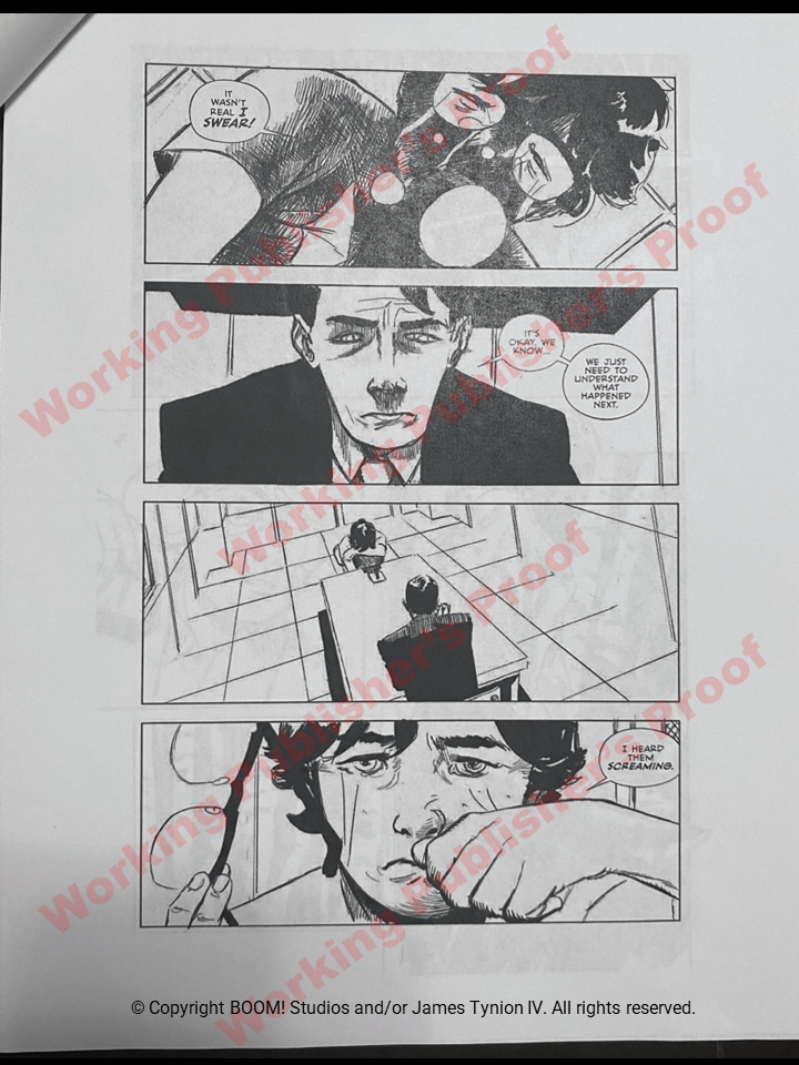
A Working Publisher's Proof (WPP) is the earliest version of a publication that allows the design, editing and creative staff to evaluate various options and layouts. The WPP allows the editors to consider various creative approaches for the content besides the interior pages as well as fine tune layouts and positioning of words. Like this example, a full print of the publication allows the staff to consider the book in totality and ensure consistency of theme and design throughout. Everything that the artist has not provided needs to be created by a BOOM designer. This includes:
A Working Publisher's Proof (WPP) is the earliest version of a publication that allows the design, editing and creative staff to evaluate various options and layouts. The WPP allows the editors to consider various creative approaches for the content besides the interior pages as well as fine tune layouts and positioning of words. Like this example, a full print of the publication allows the staff to consider the book in totality and ensure consistency of theme and design throughout. Everything that the artist has not provided needs to be created by a BOOM designer. This includes:
- Front cover typography, creative team credits & title graphic designs (5 examples below)
- Inside front and back cover colors & designs (21 examples below)
- Credits page color options with book arc title, creative team, BOOM designer & editors, and legal birdseed (3 examples below)
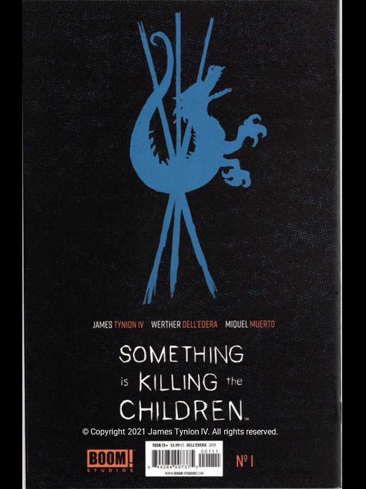
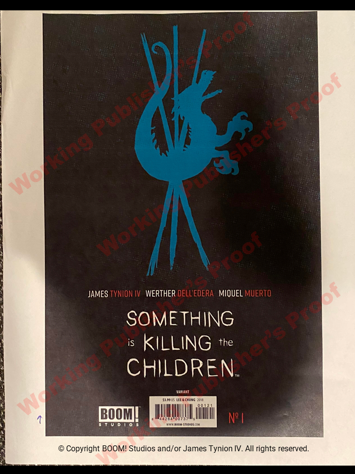
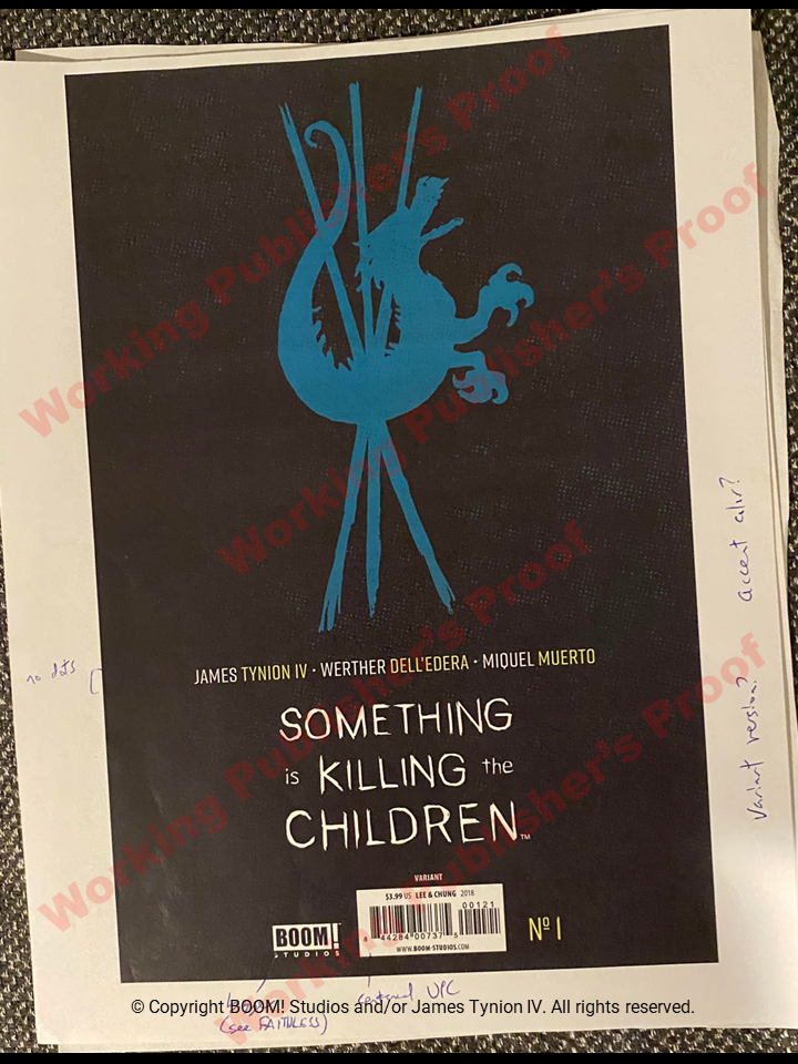
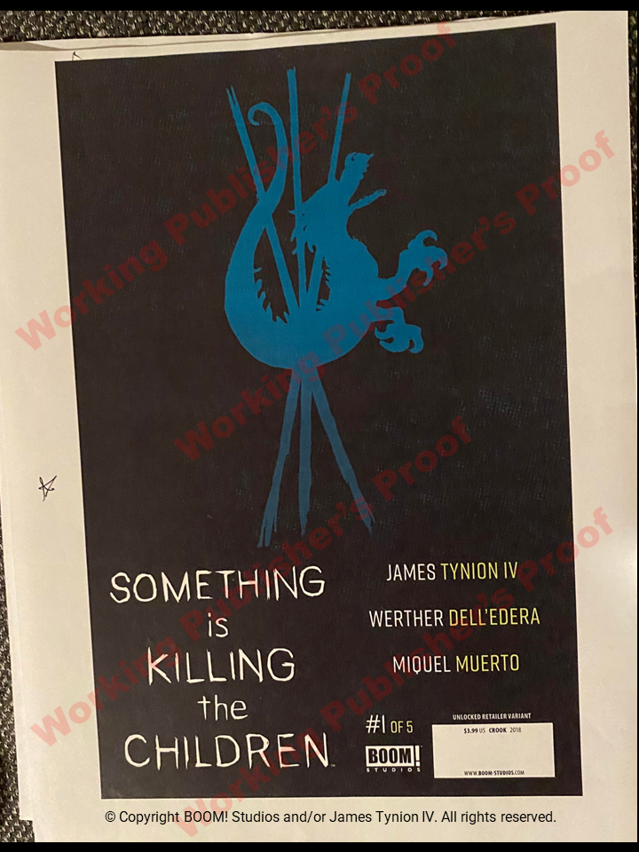
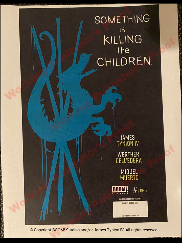
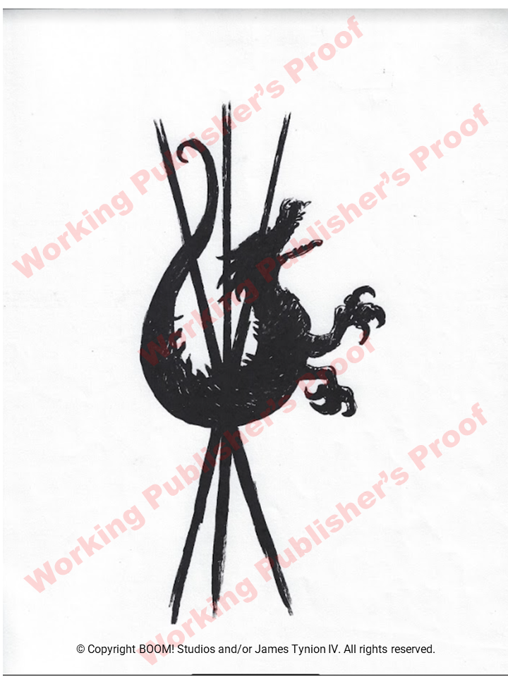
- Back cover layout, colors & content (4 examples below)
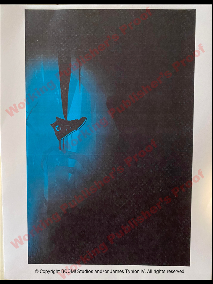
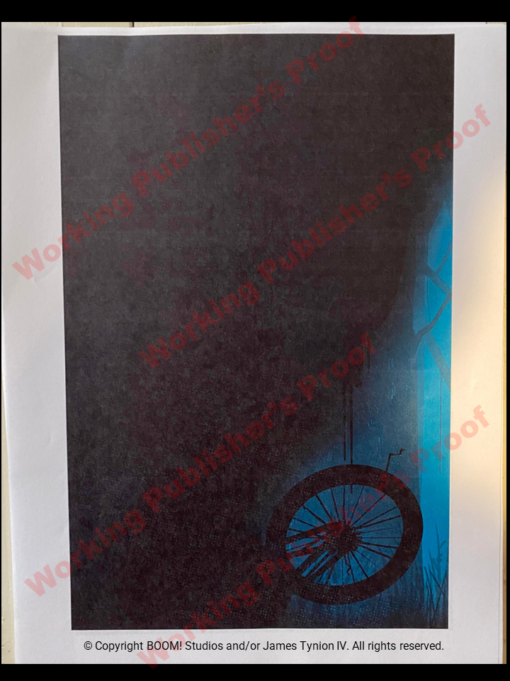
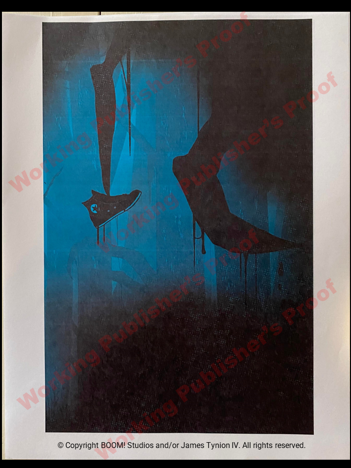
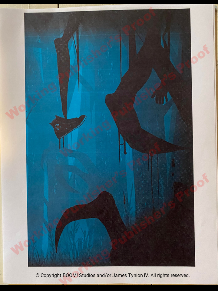
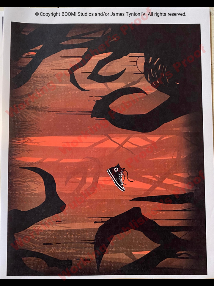
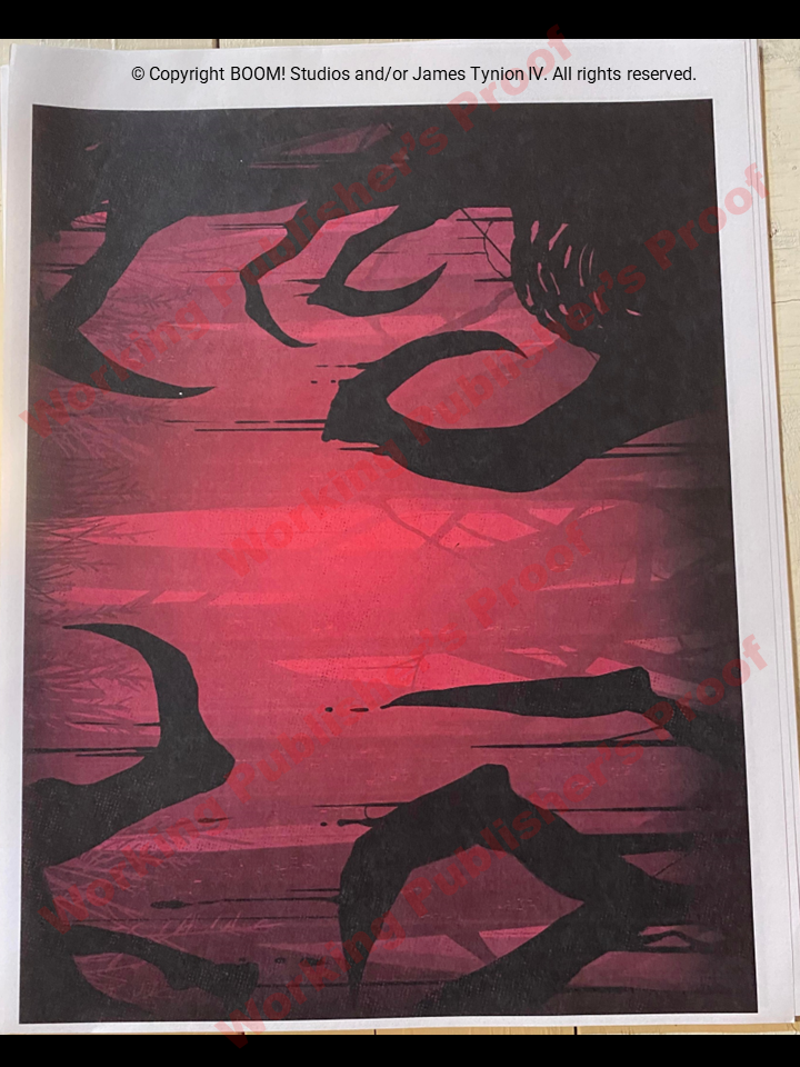
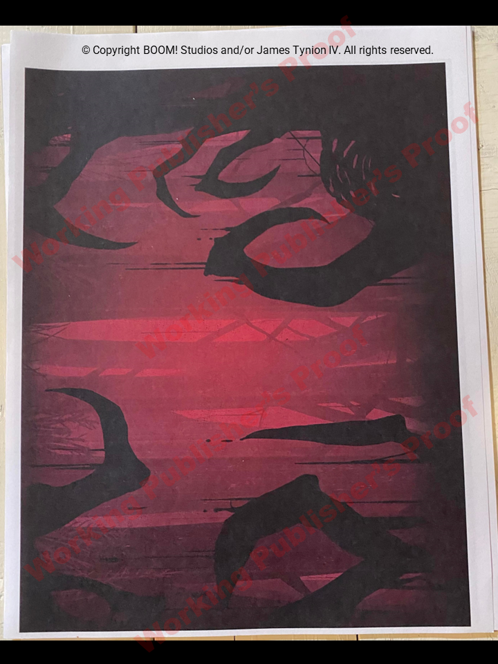
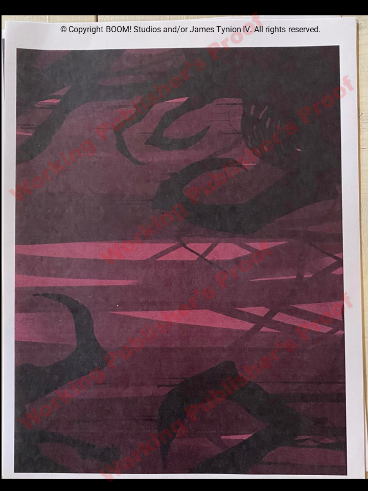
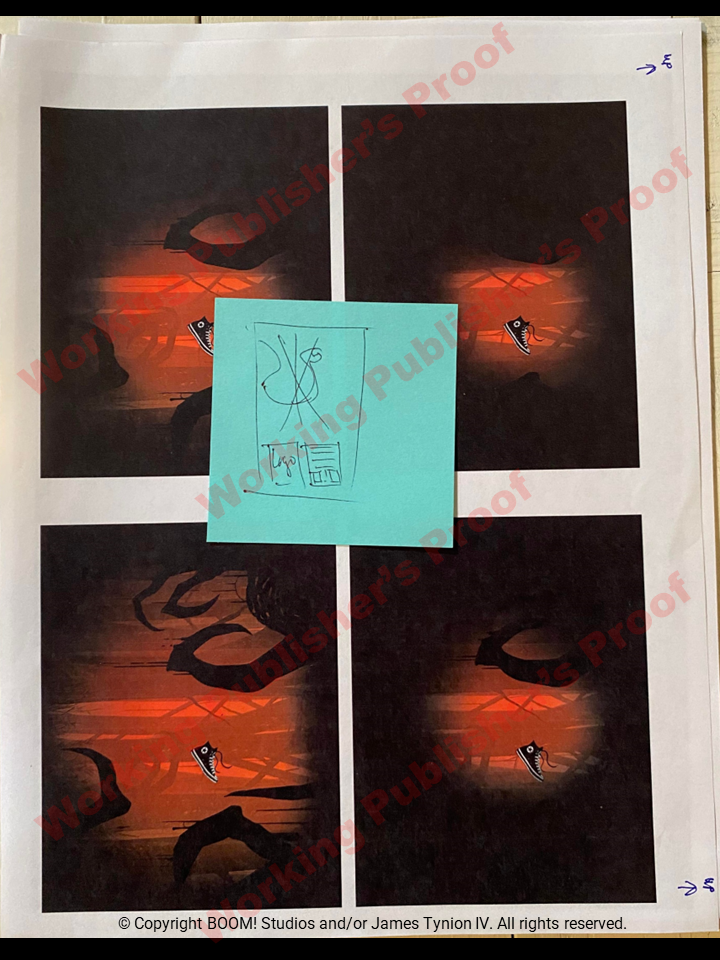
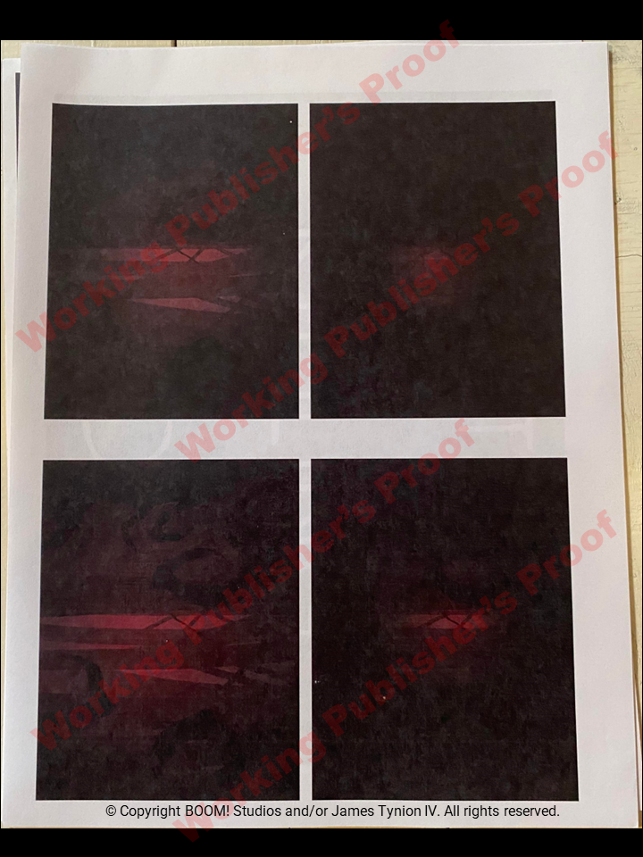
- Non-creative splash page creative treatment including layout, colors & graphic designs. I imagine it's rare that the publisher design team so heavily influences the interior pages but we see it here in the shock splash pages 6 & 7 (17 examples below)
There is method to my madness here. Given the multiple versions of each page, the first one displayed next to the published version is the closest to final. As you go through the images, they move farther and farther away from the published page. Pay close attention to the words in the WPP's interior pages. In some places it's different than the published version.
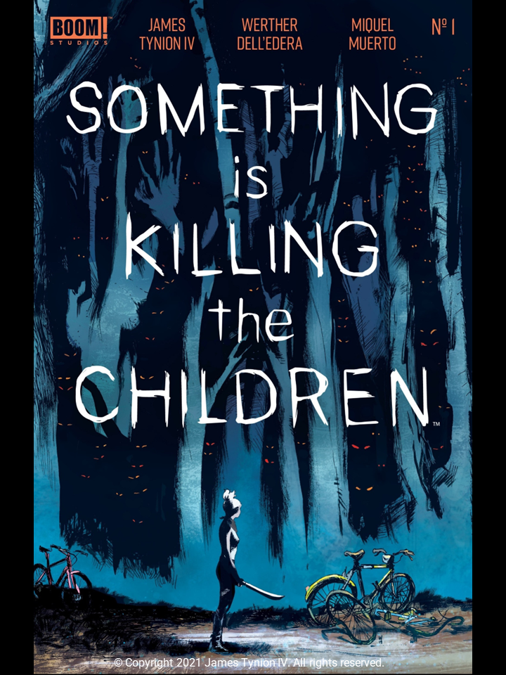
Front Cover - Published & Earlier Versions
|
Published
|
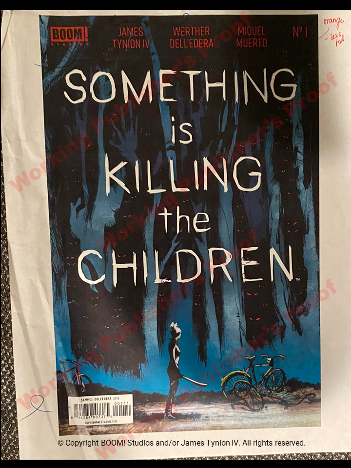
WPP
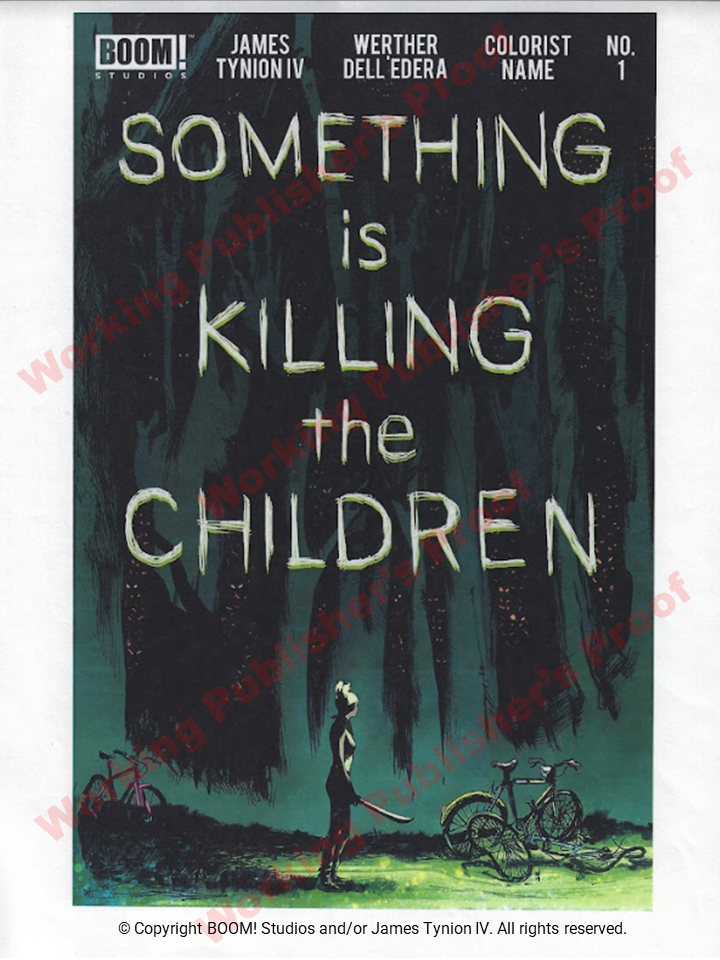
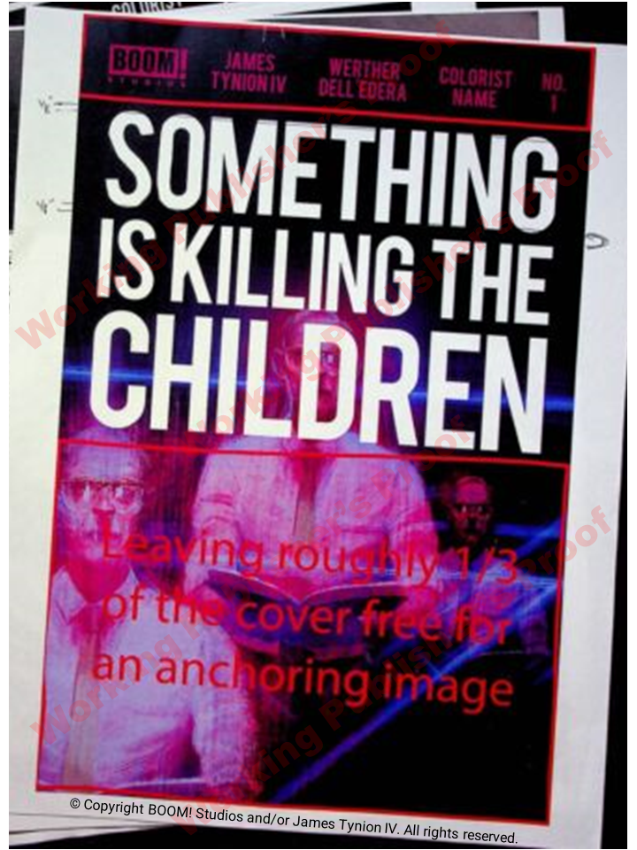
This cover is closest to final with Miguel Muerto's name as colorist in the credits. Note the 3 circled monster eyes close to the title that were removed from the published version on the left. Final colors at the top were made orange instead of red as noted on the edits. Also the eyes are red and the final version are more of a light orange/yellow.
|
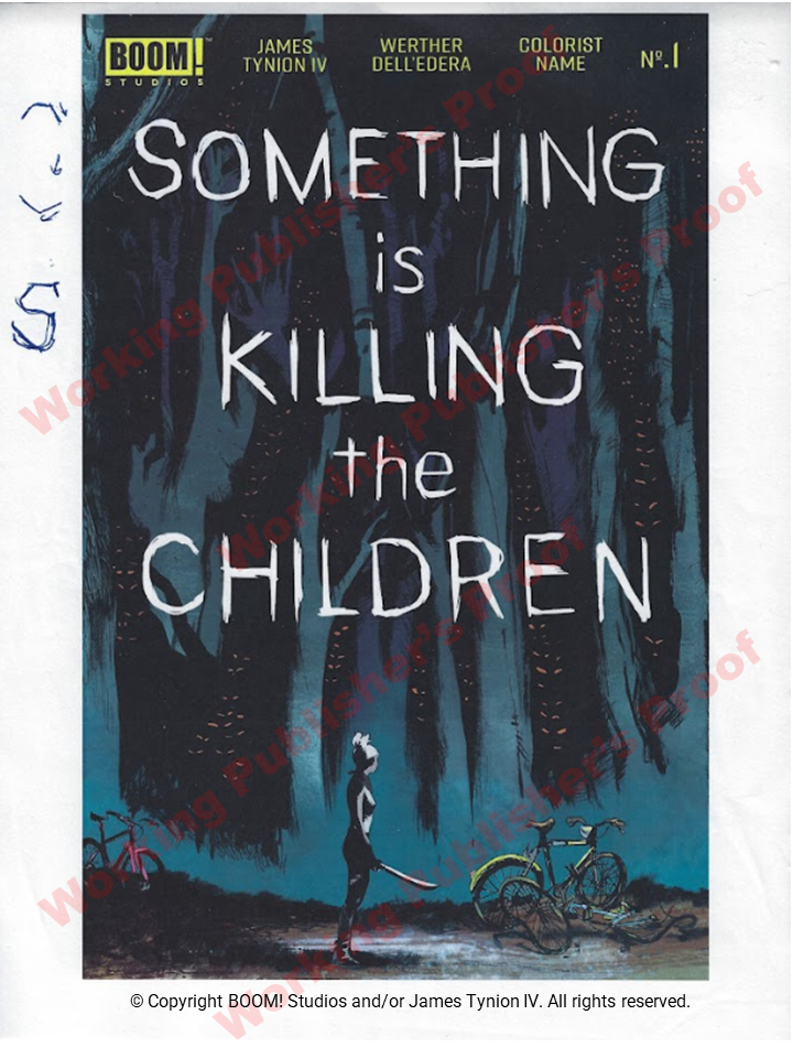
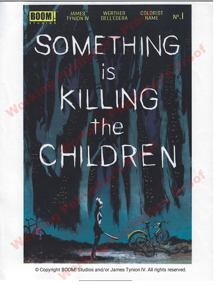
These 3 alternative final covers are really interesting, changing up background colors, title colors, even a different color for the main book. These are earlier versions than the one above, as noted by COLORIST NAME in place of MIGUEL MUERTO.
|
WPP
Background colors appear the same as published, however the BOOM logo, credits and issue number are yellow. The eyes are a very light orange/yellow as published. I'm not sure what the editor was getting at with the written "S" on the side but this letter changed in the next 2 versions to the right.
|
WPP
Again, background colors appear correct but they are still messing with the "S" in the title. The BOOM logo, credits and issue number are yellow but a bit lighter than the one on the left. The "No." for issue number has a different design than the final version above.
|
WPP
This one is really different. Background colors have a greenish/yellow hue, the title is a faint yellow, they are still messing with the "S", the content at the top is white in a thicker and larger font. The "No. 1" appears the farthest from production. Absolutely none of these variations made it into the final version above. I believe this was the earliest rendition of the final selected cover.
|
Front Cover - Alternate Versions
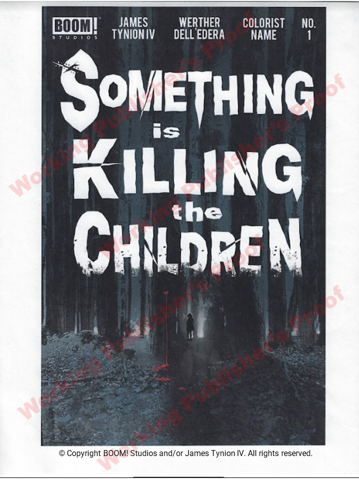
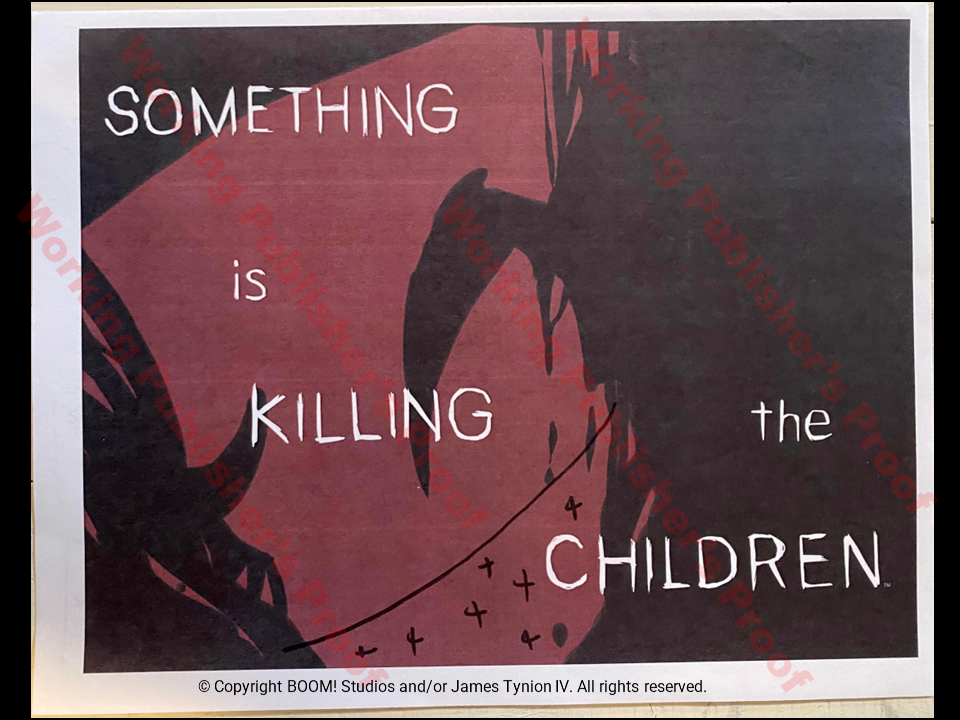
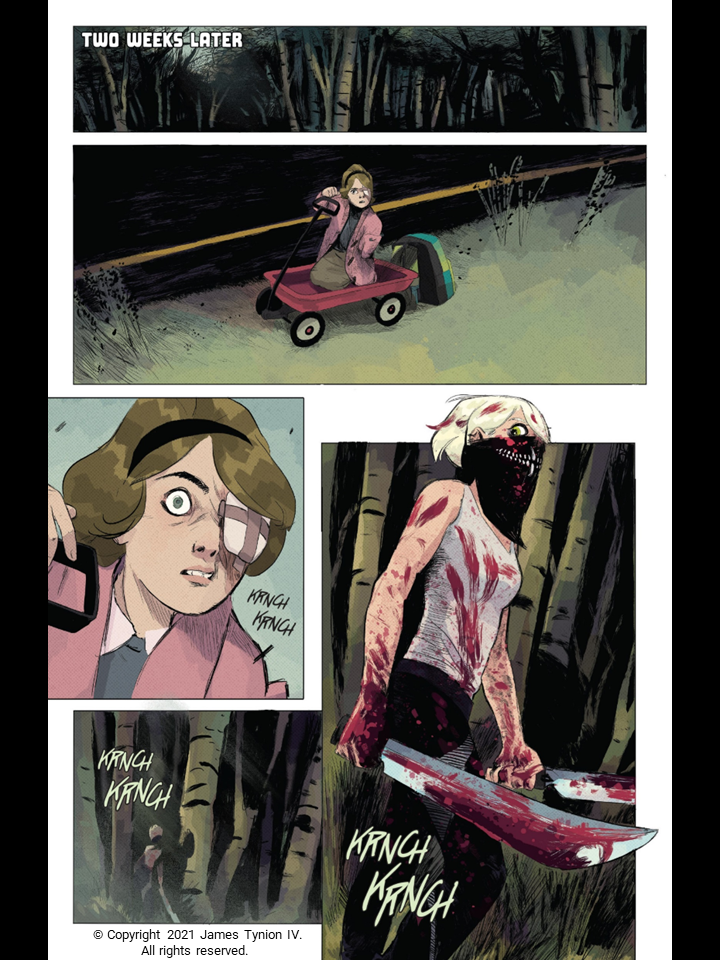
Clearly an Issue 1's cover makes a statement and I really applaud James, Werther and BOOM for creating such an elegant version. It carries an air of innocence which I think echoes Erica's journey from a young girl to the monster killer we meet on Page 8 of Issue 1. I'm not sure if they were thinking that far ahead as there is evidence on the WPP back covers that they only planned 5 issues, and Erica's back story is not revealed until issues 16-20, but it really works for me. The issue 1 cover also does not give any indication of the pure insanity that comes in the monster attack on pages 22 to 26.
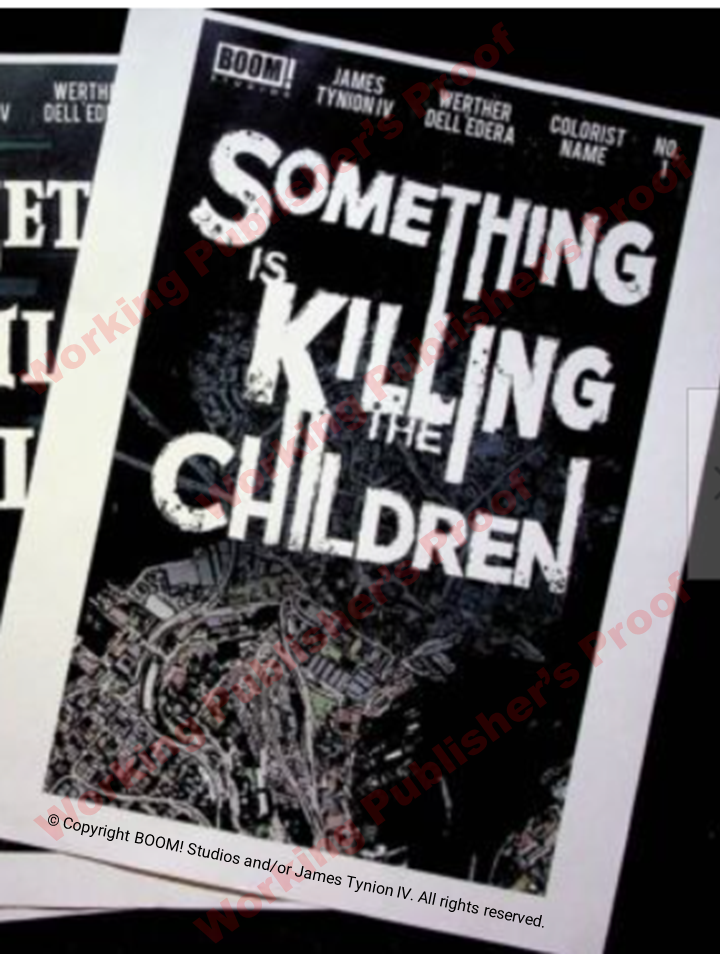
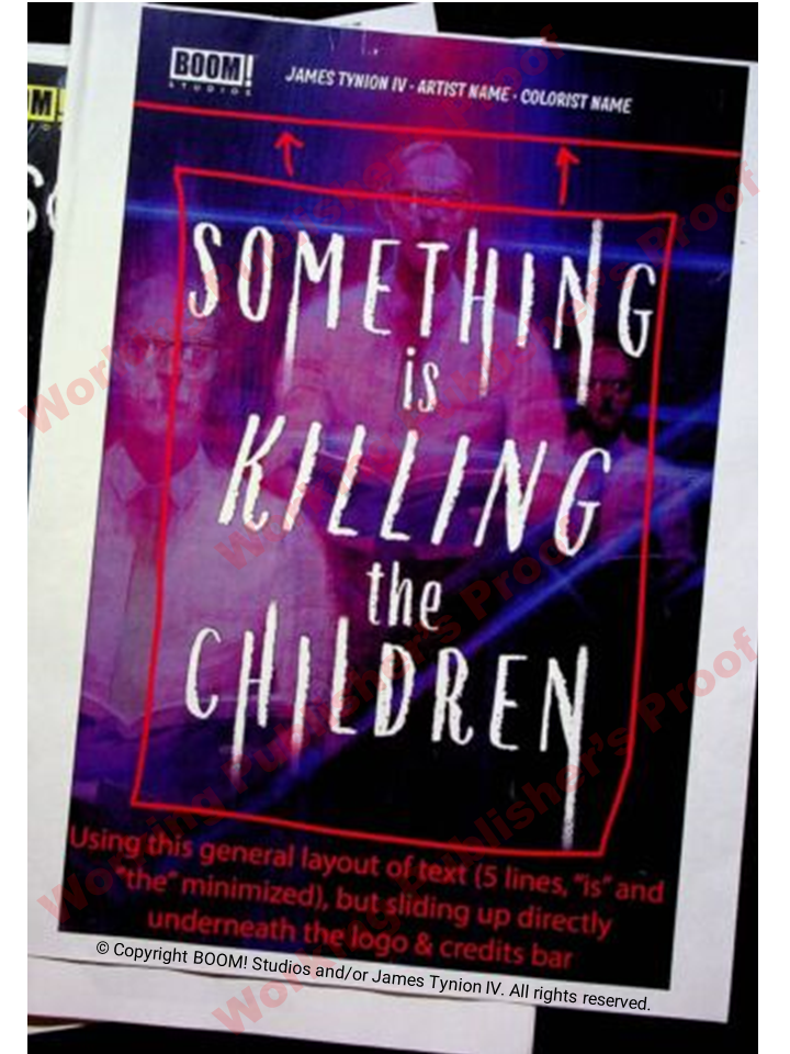
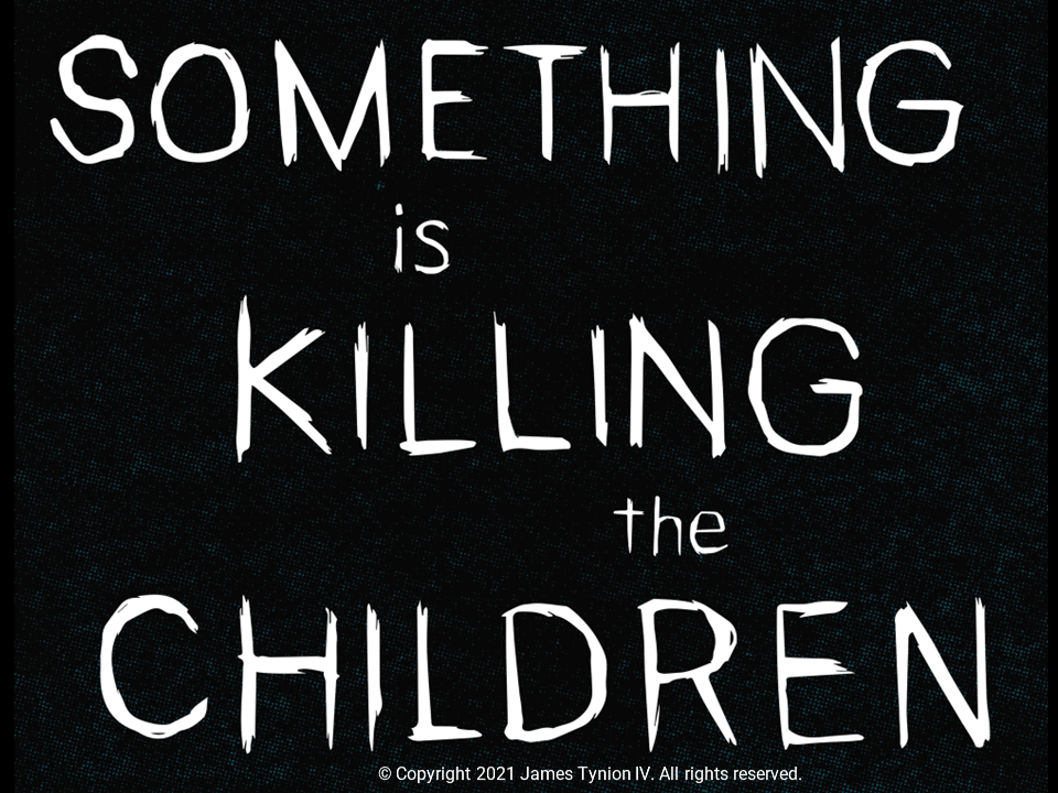
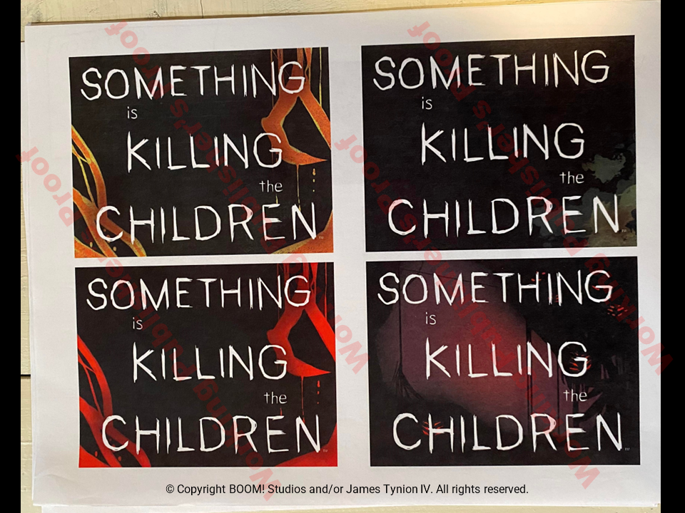
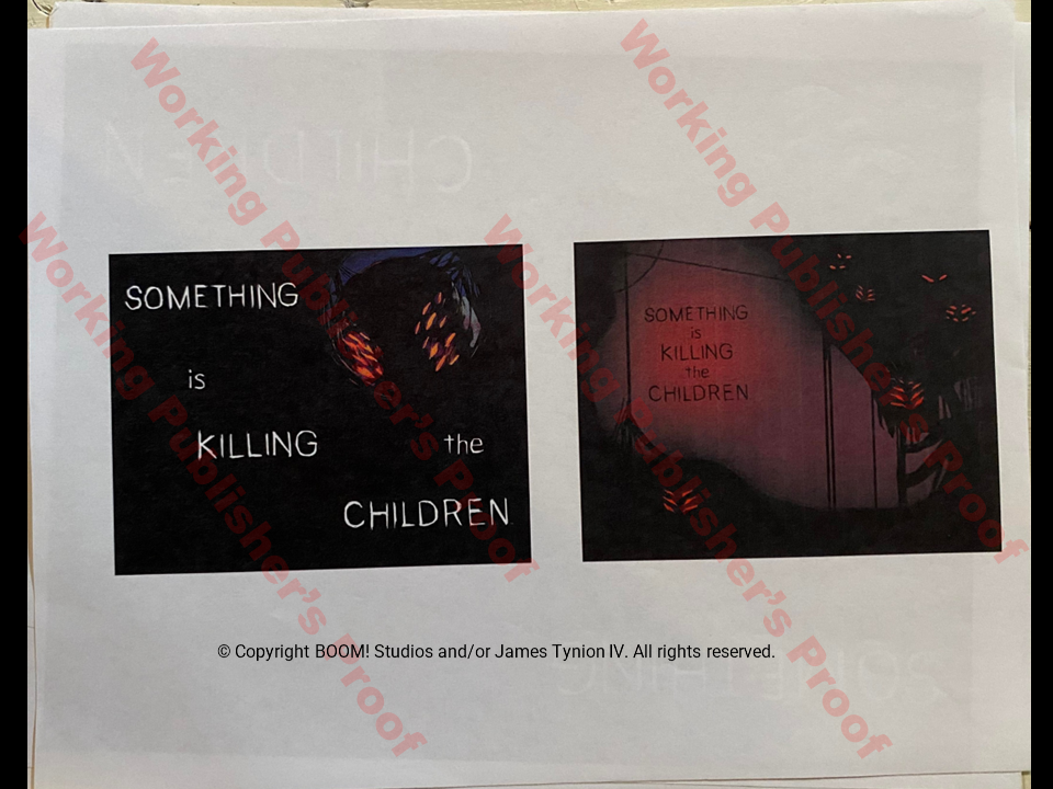
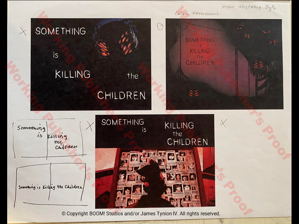
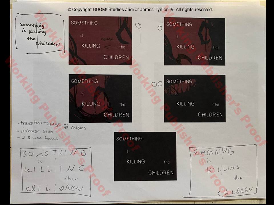
The below covers are primarily designed to test the title design, size and placement. Placeholder images are used in the background. I find the first one here particularly interesting. In addition to the knife slashes throughout, the letter S has a trepanning scar and stitches as do all members of the Order of St. George.
The below covers are primarily designed to test the title design, size and placement. Placeholder images are used in the background. I find the first one here particularly interesting. In addition to the knife slashes throughout, the letter S has a trepanning scar and stitches as do all members of the Order of St. George.
Inside Covers
Working Publisher's Proof Inside Cover Options
Back Cover
Who would think so much work goes into a back cover? I absolutely love that the back cover design stays the same throughout the series and changes colors that match the inside front and back cover. It also creates a perfect spot for signatures in my opinion. Also absolutely fascinating is the versions that are oldest in the second row, as indicated by the lack of UPC symbol, have "#1 of 5" when the series was only expected to be a 5-book limited run series. Aren't we all thankful that didn't happen?
Credits / Variant Covers Page
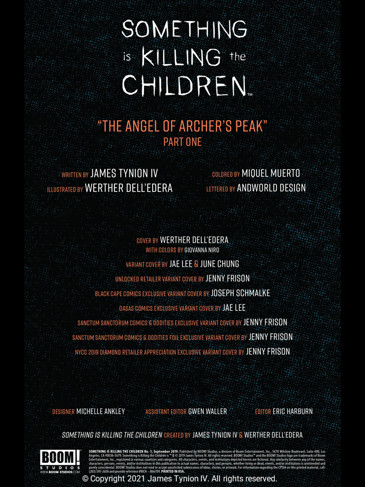
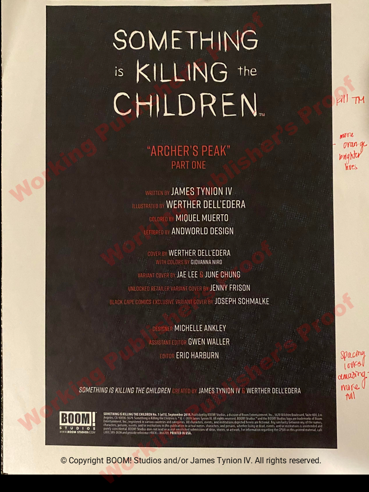
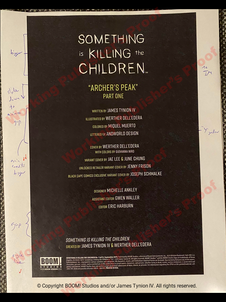
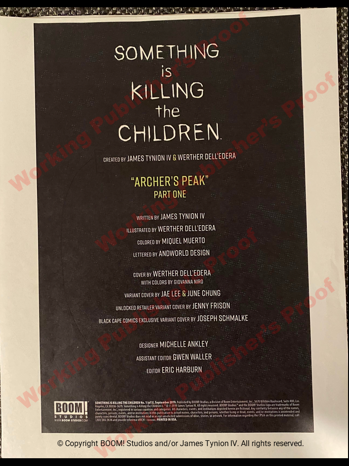
For what should be a pretty boring page, this is super interesting. All kinds of variations here among the 3 WPP copies - colors, fonts, layouts. The one to the right of the published copy is closest to the final version and the last one the most different. Check this out - even the issue's name was changed from "Archer's Peak" to "The Angel of Archer's Peak". Fascinating what is found in this proof! It's also interesting that the 3 Frison exclusives were not on here in the WPP stage. Adding these required a layout change to have the creators, artists, designer and editorial team's names placed horizontally instead of vertically.
Interior Shock Splash - Pages 6 & 7
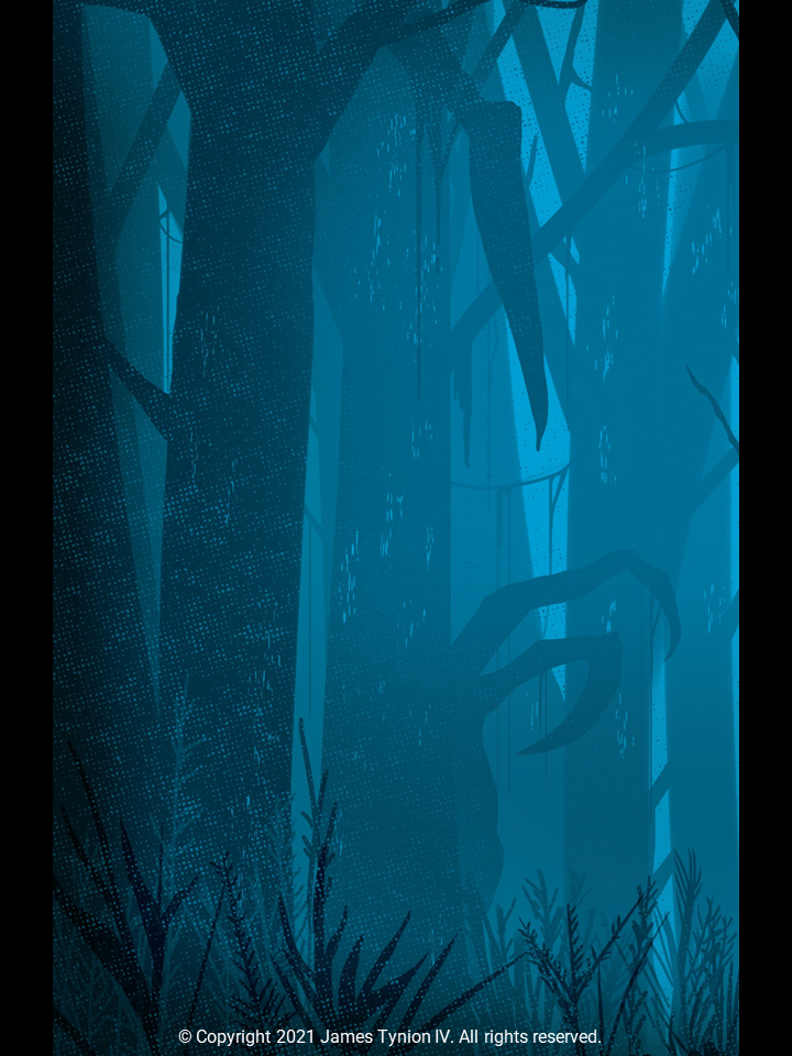
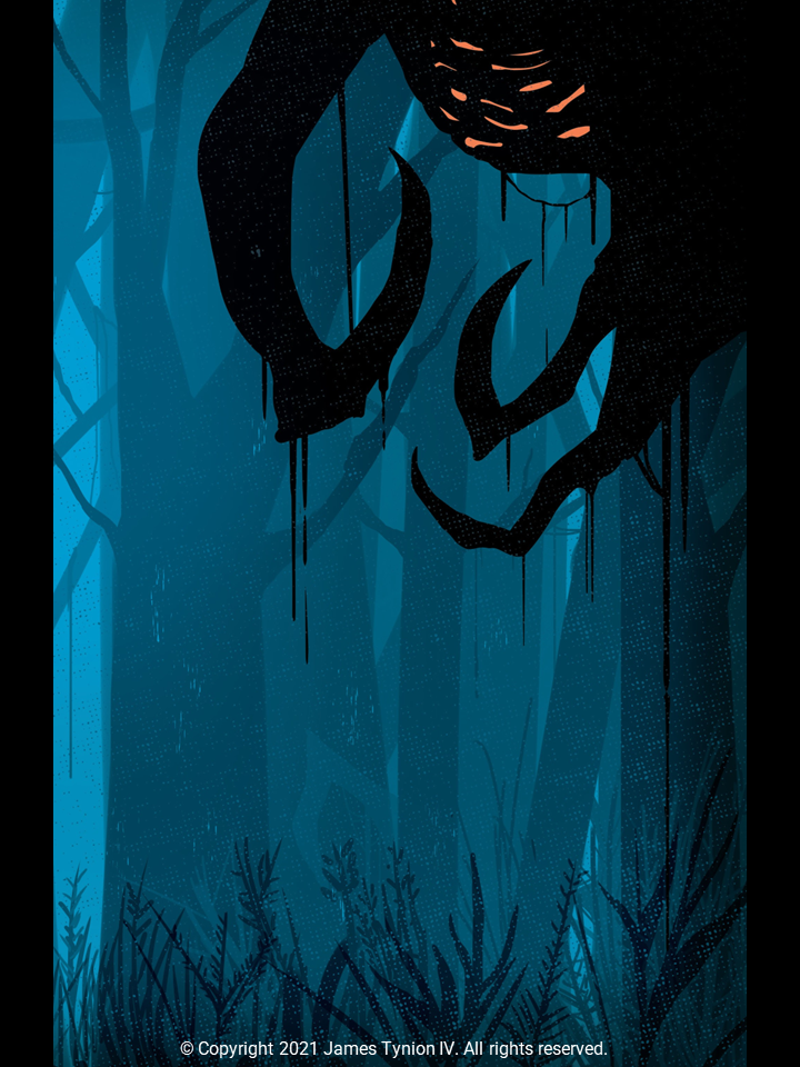
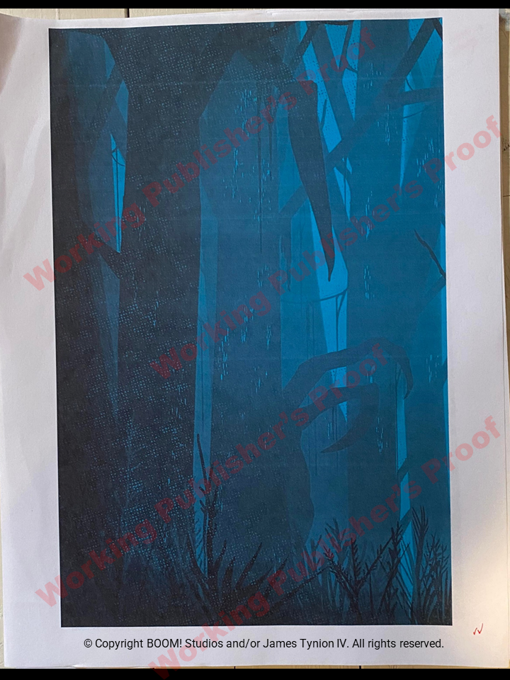
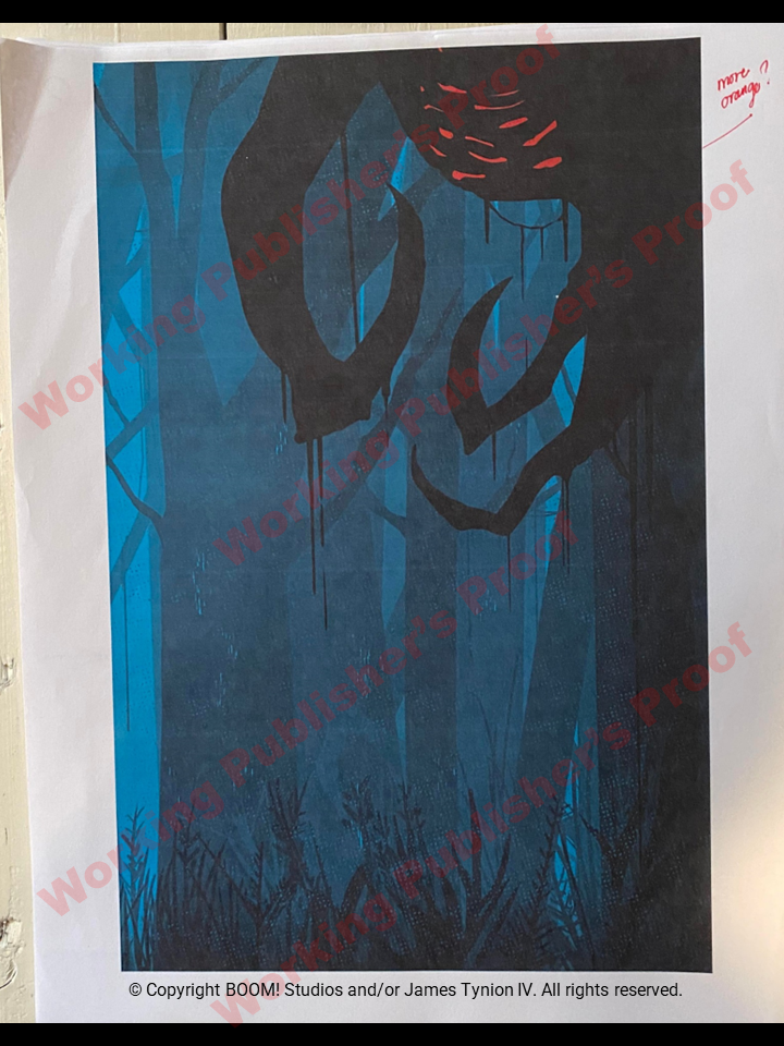
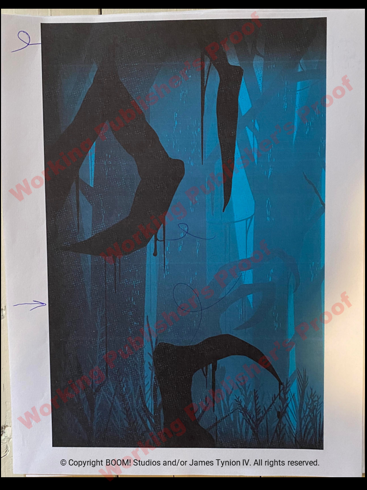
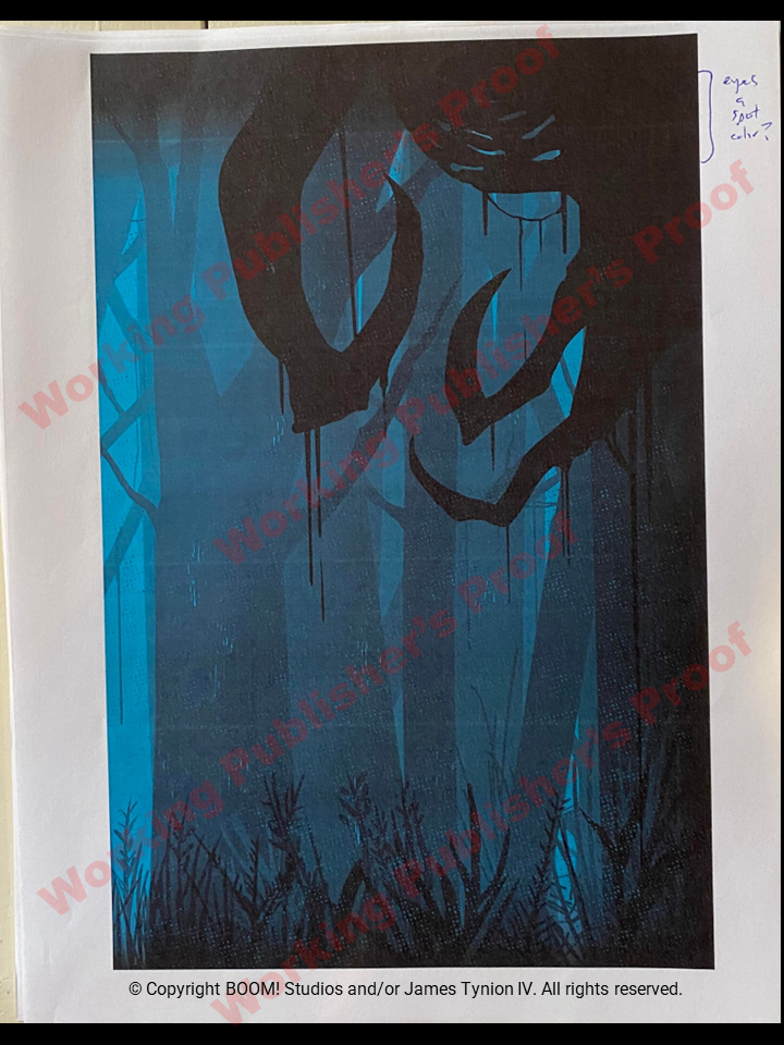
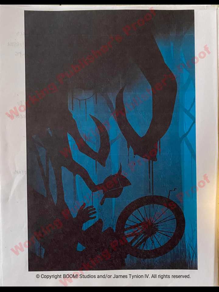
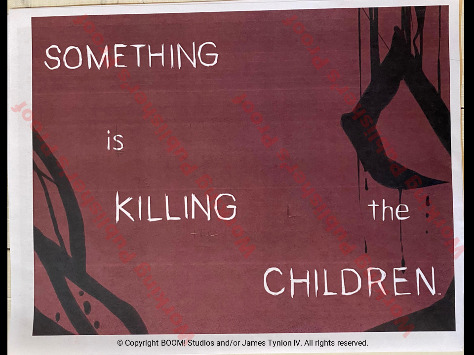
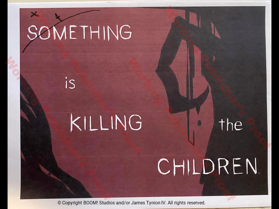
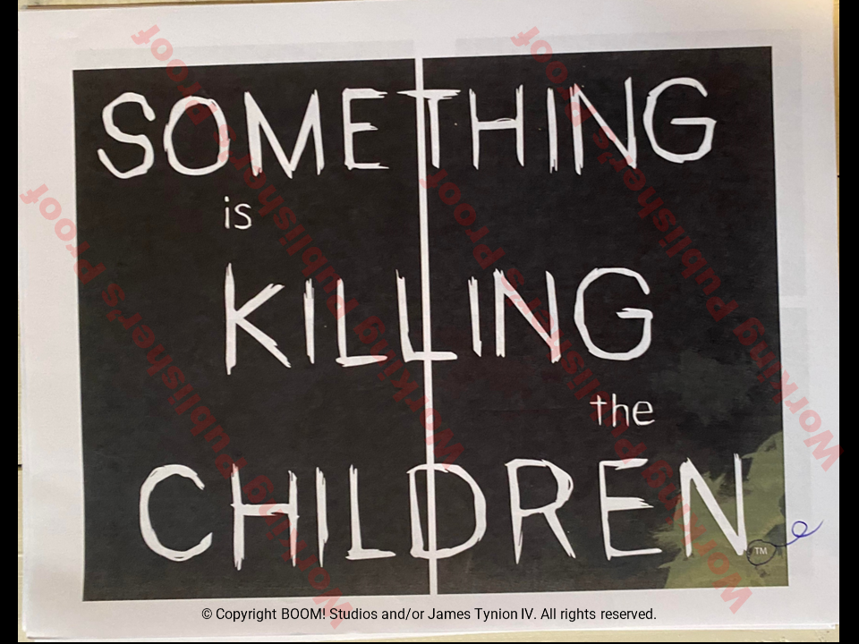
This is a pretty interesting look at the 2-page splash after a traumatized James tells Detective Roberts "I heard them screaming". Page flip, then WHAM! SOMETHING IS KILLING THE CHILDREN. The intensity of this splash reminds me of the great black & white Hitchcock horror movies with a soundtrack and visual that hits you hard. The BOOM design team considered many options here. In the end, they ditched fancy treatments for the 2 page series title white on black. Super effective and used in issues throughout the series.
WPP
I think this is what led to the final design treatment. I look at this progression from the images to the really dark one then the handwritten notes.
Interior Pages
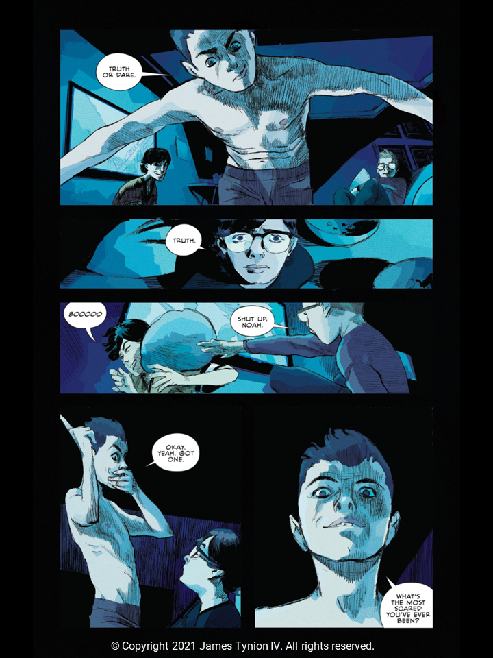
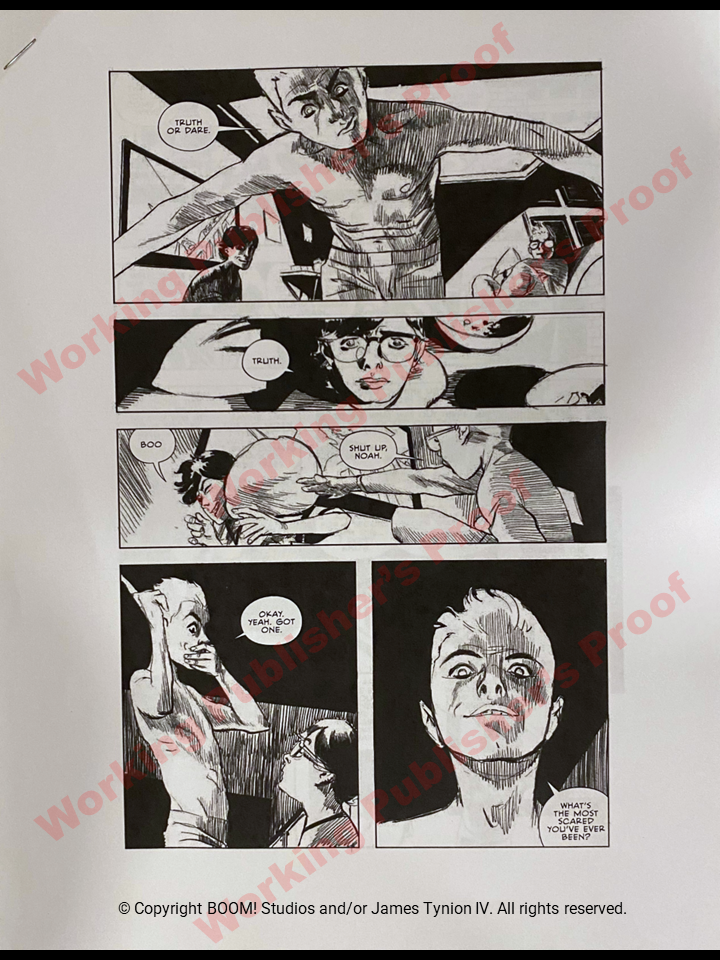
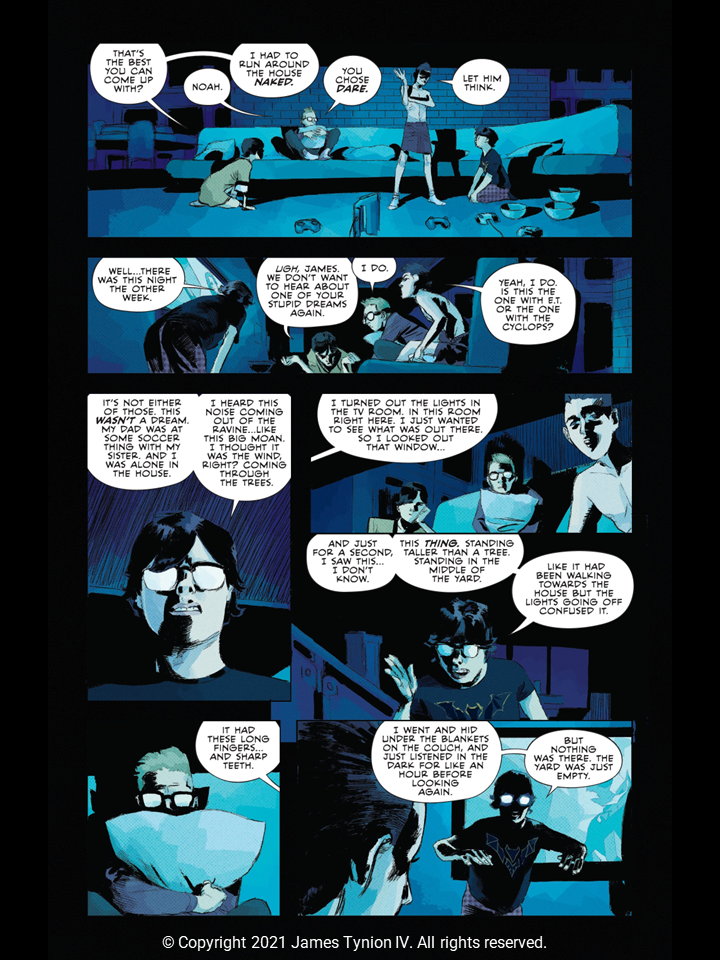
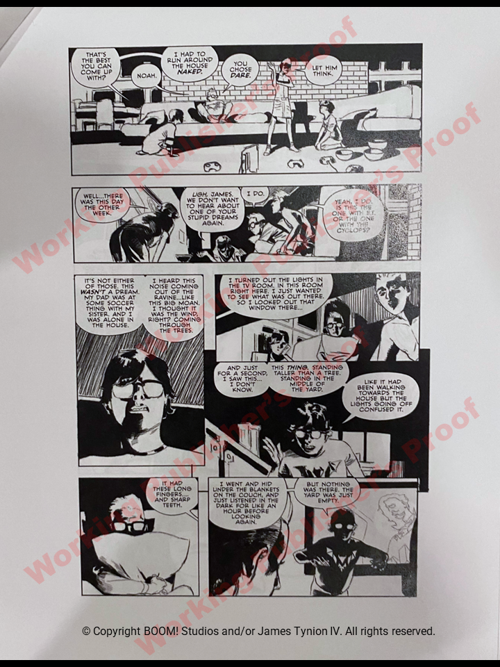
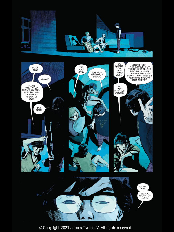
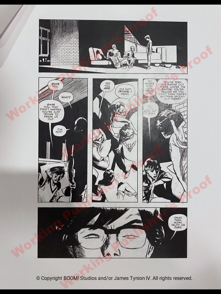
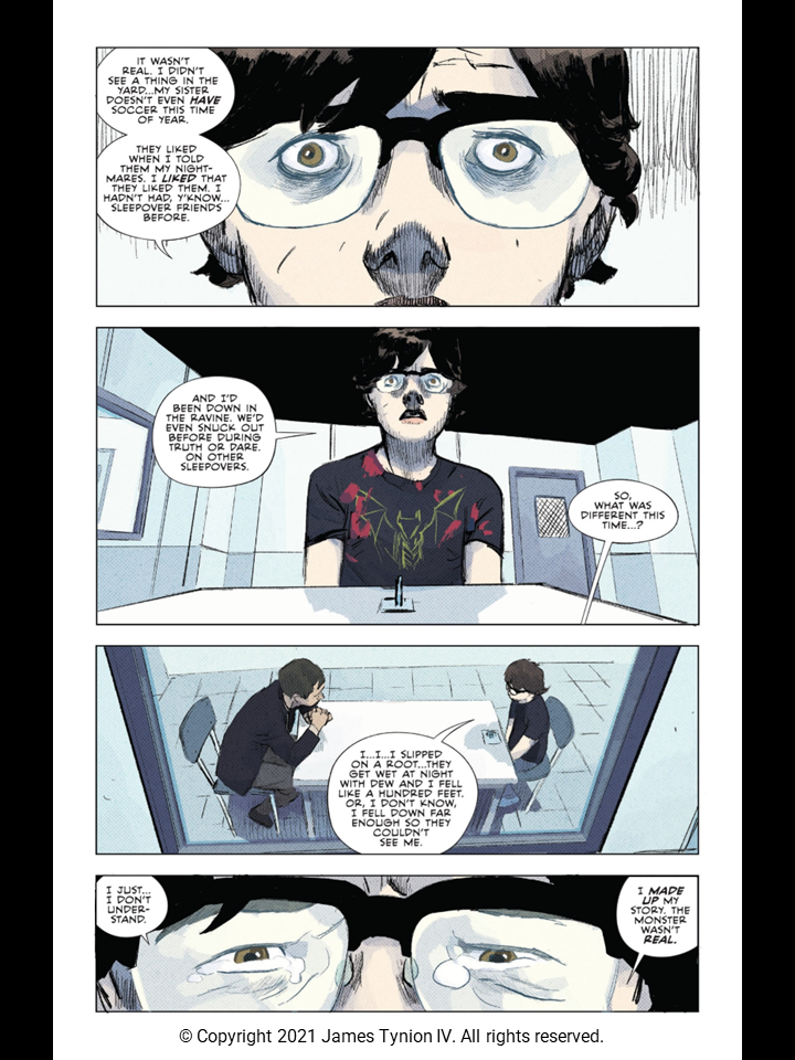
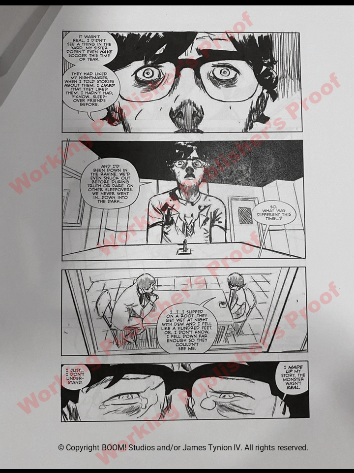
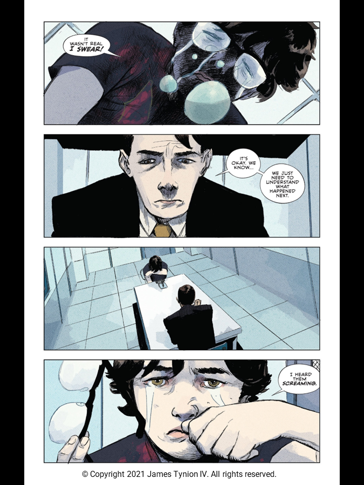
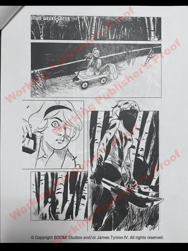
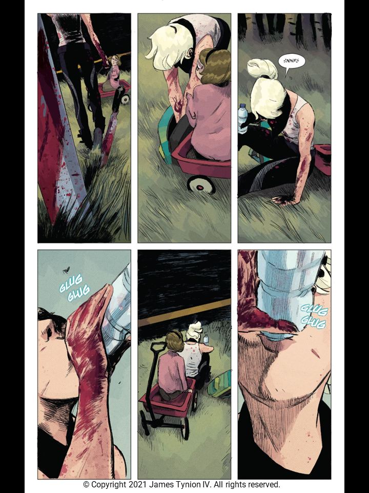
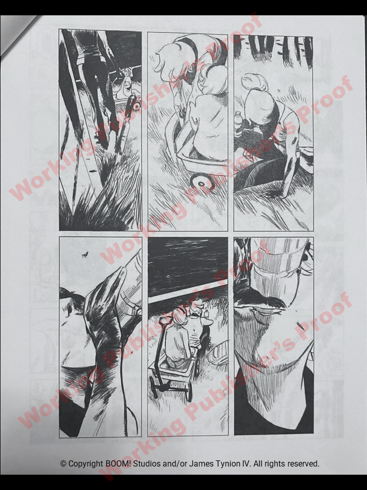
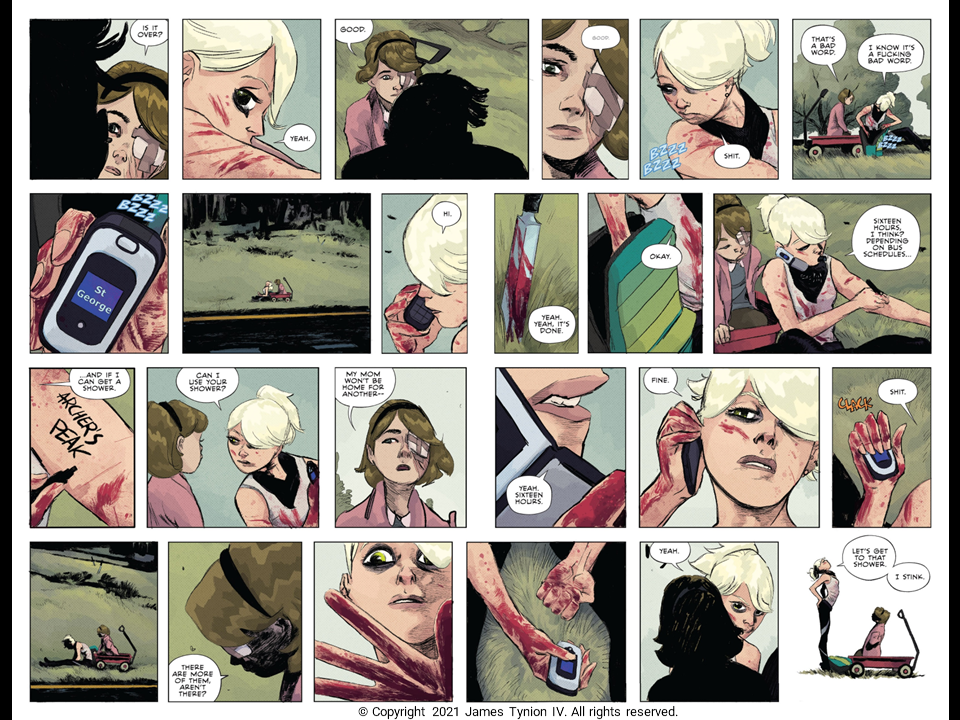
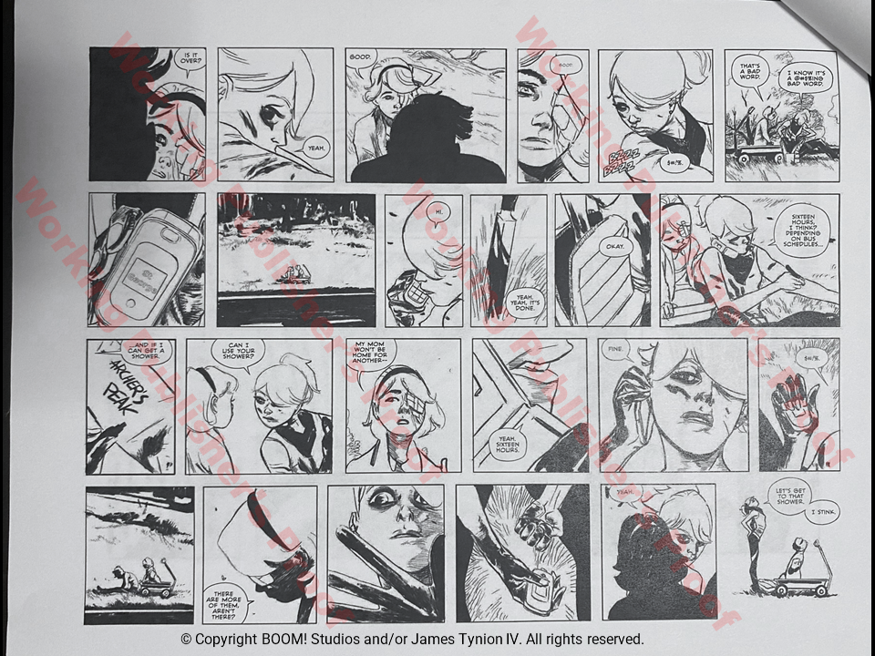
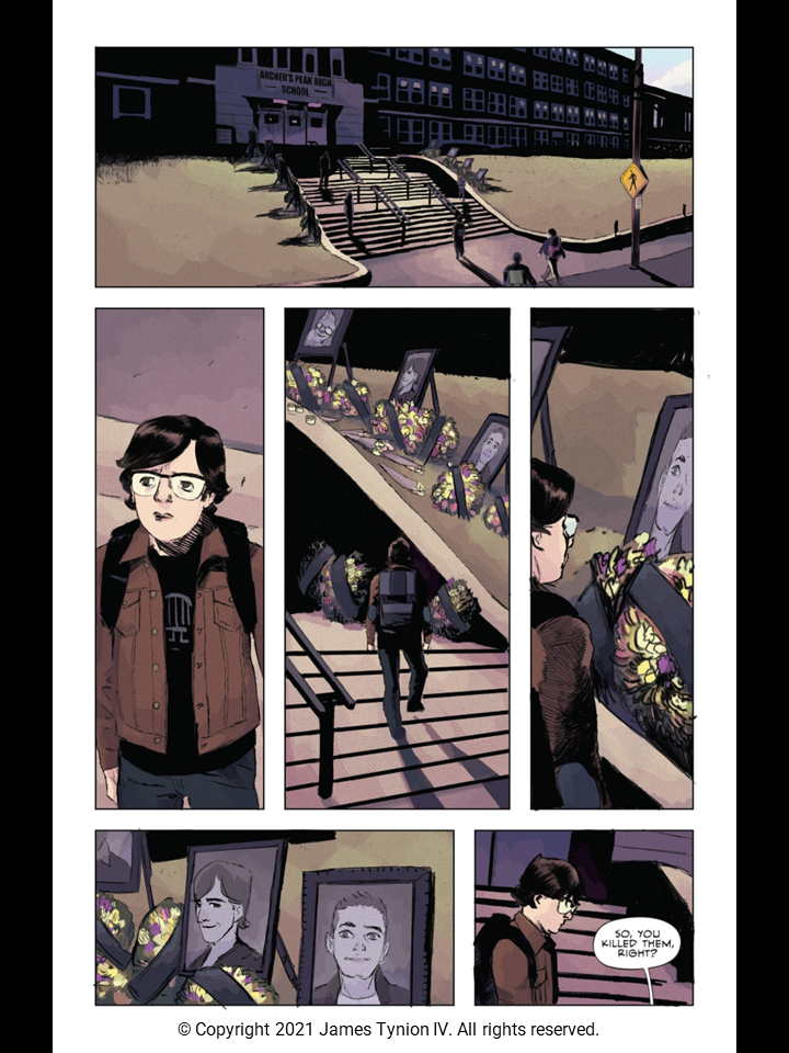
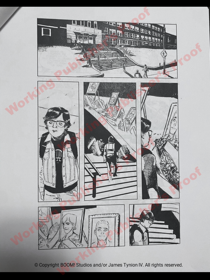
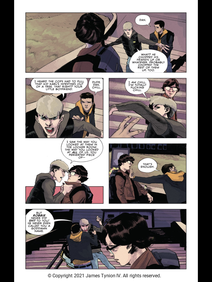
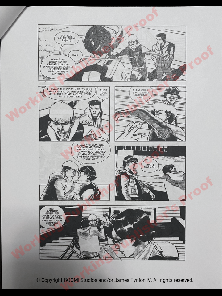
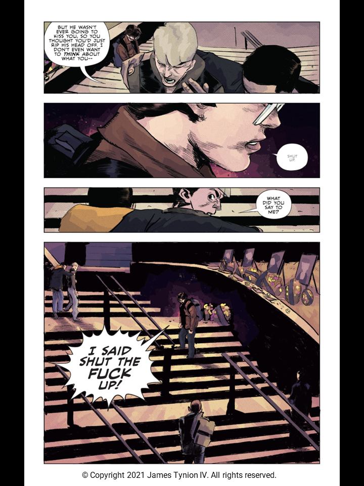
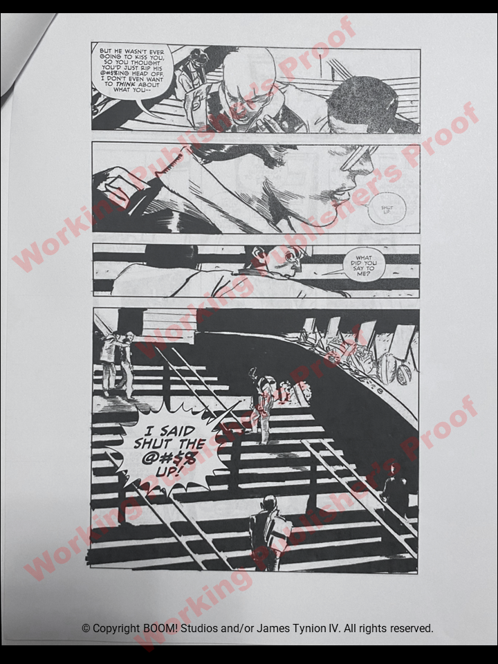
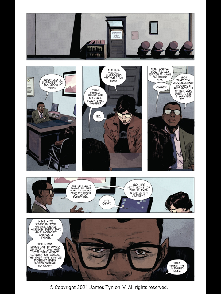
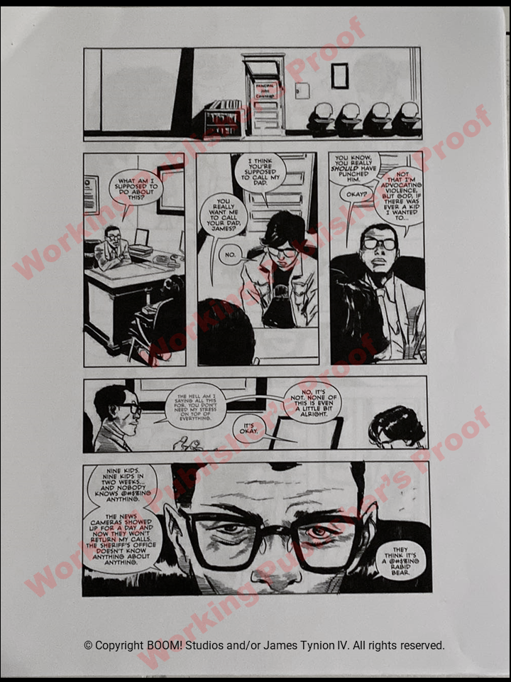
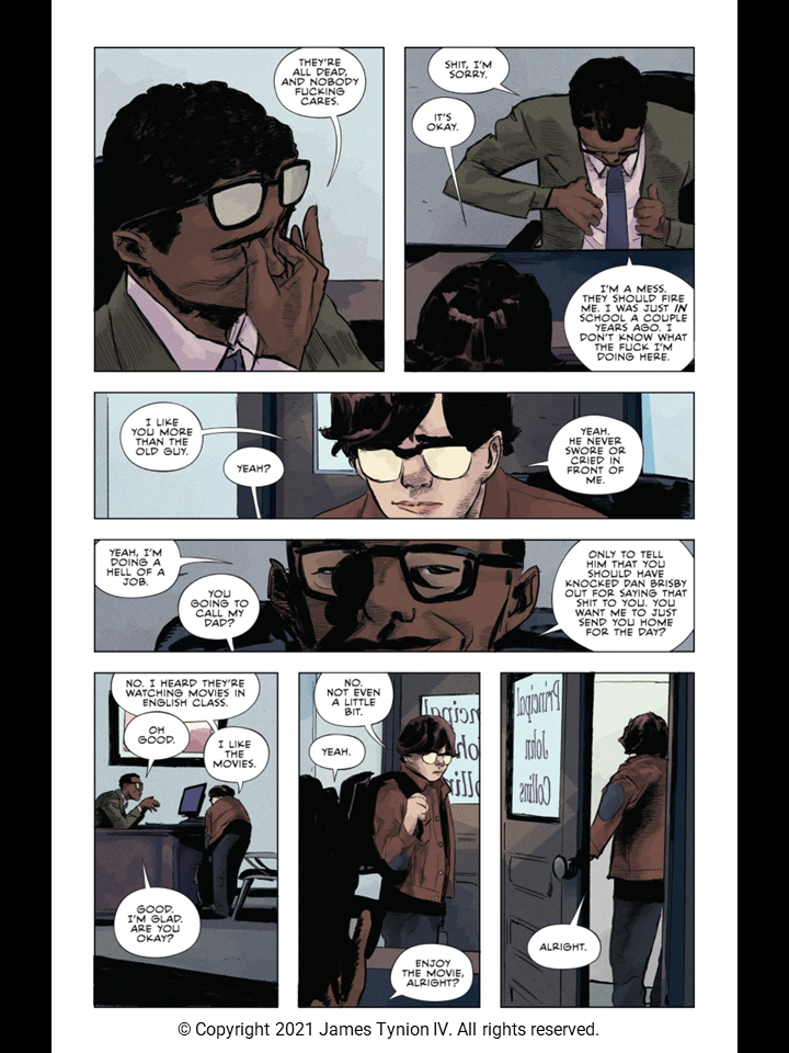
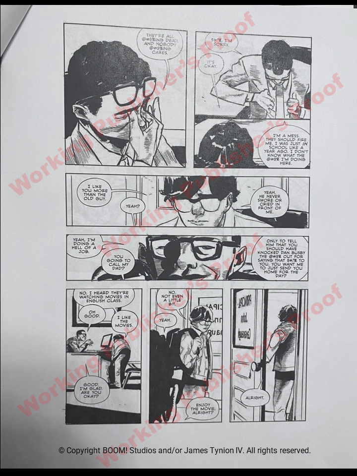
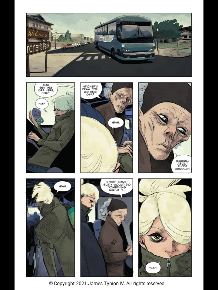
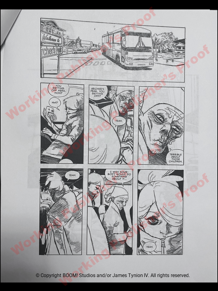
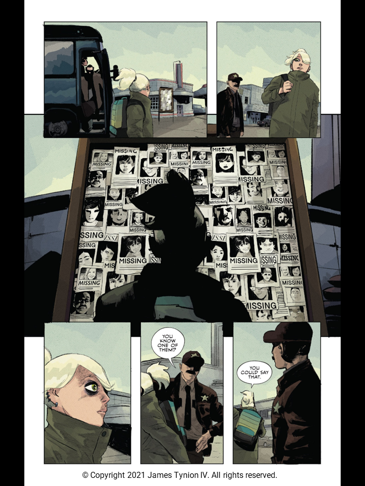
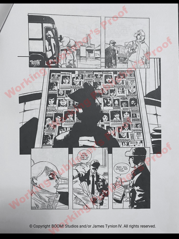
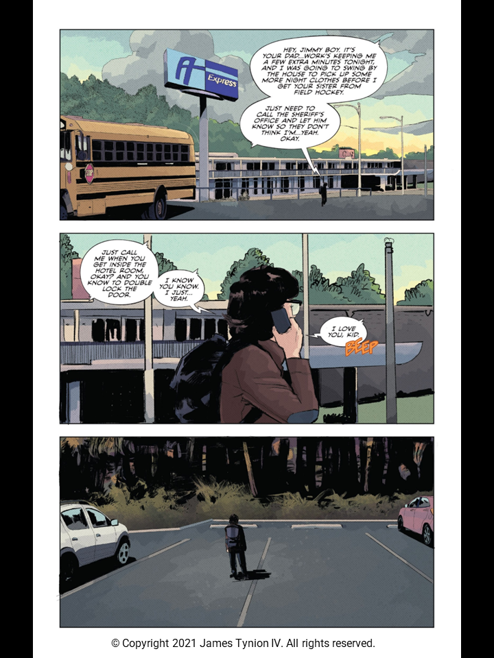
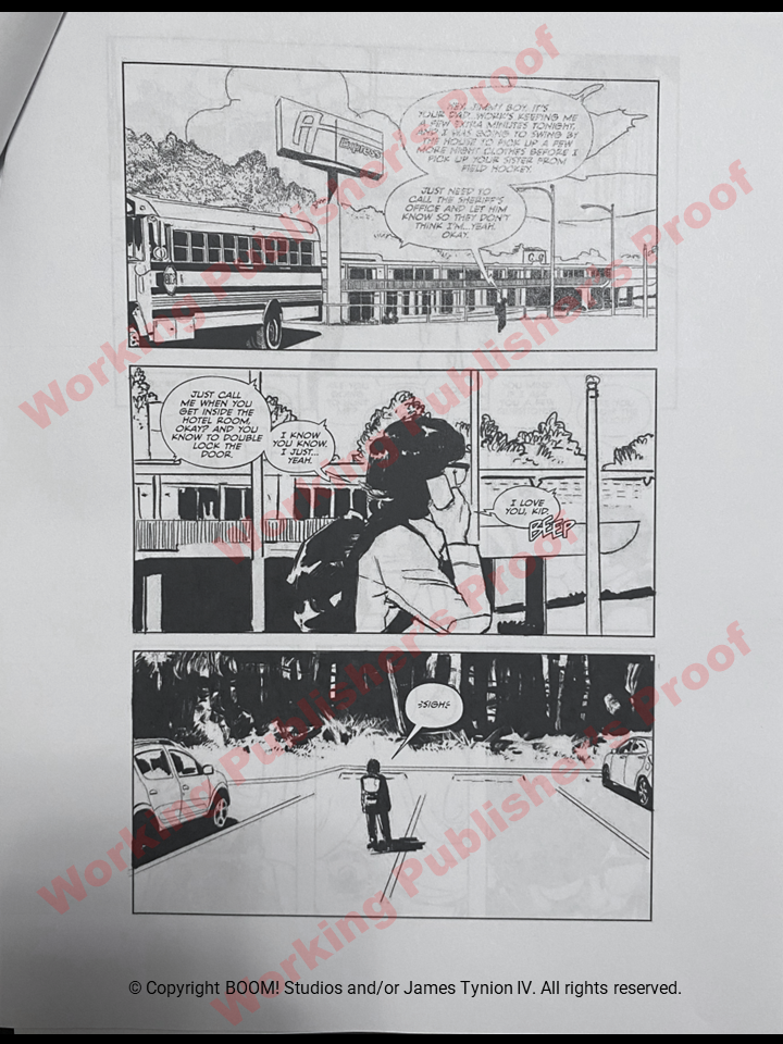
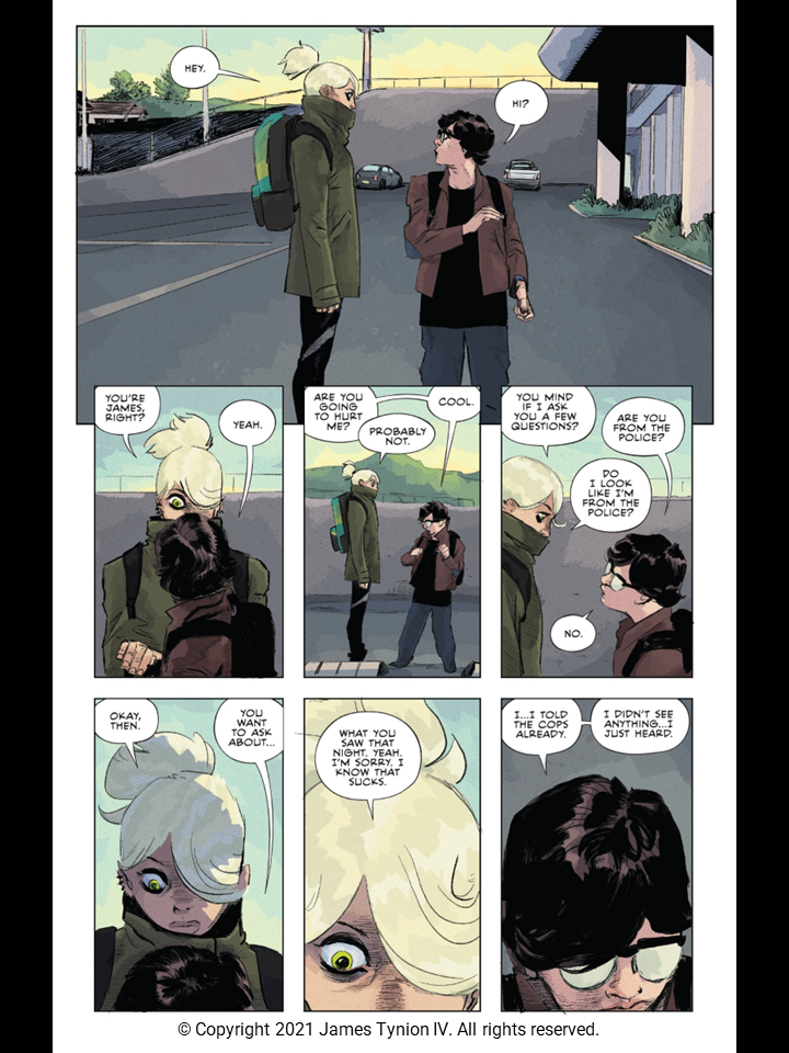
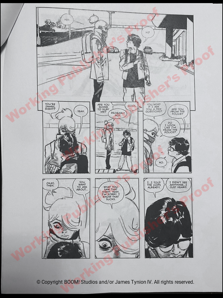
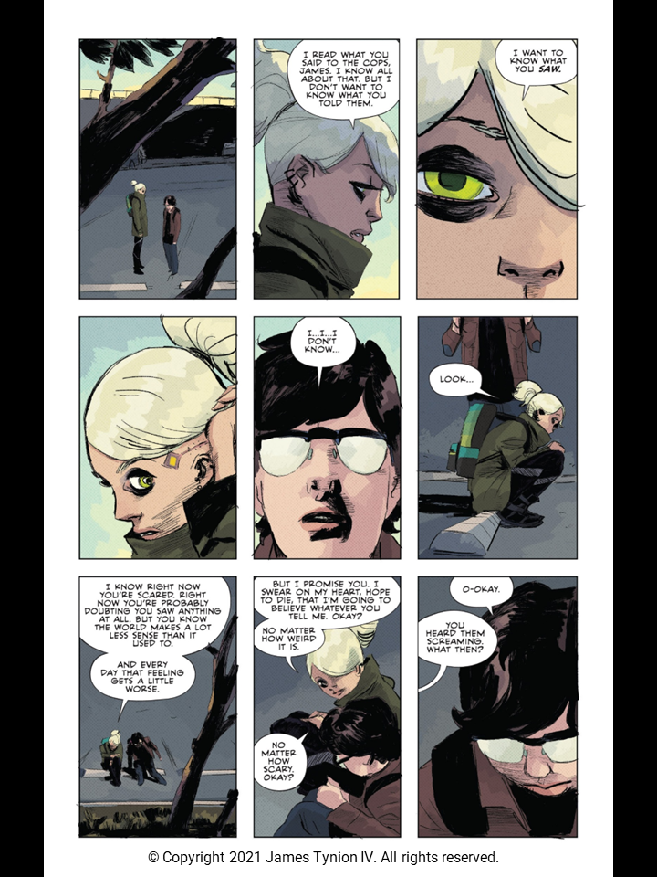
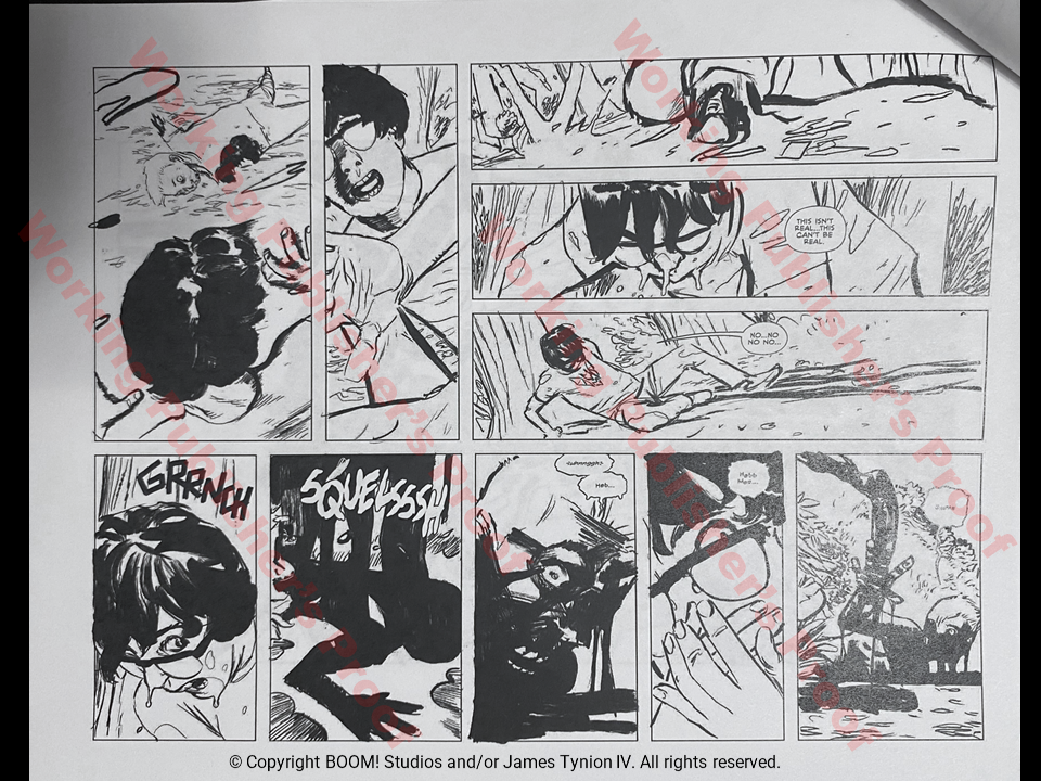
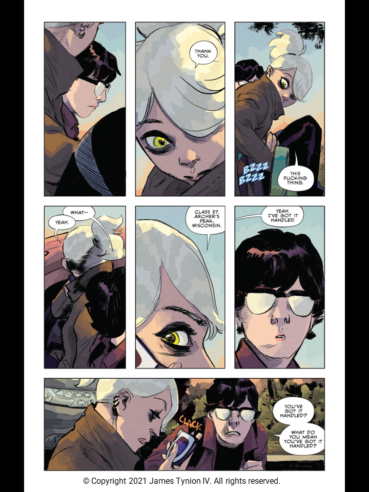
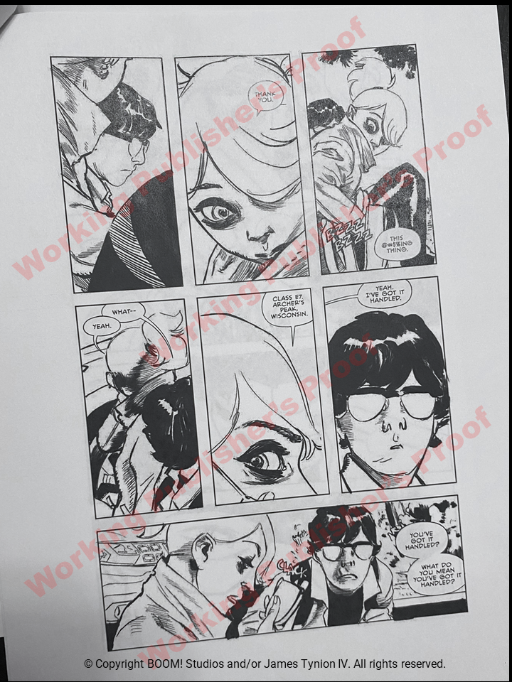
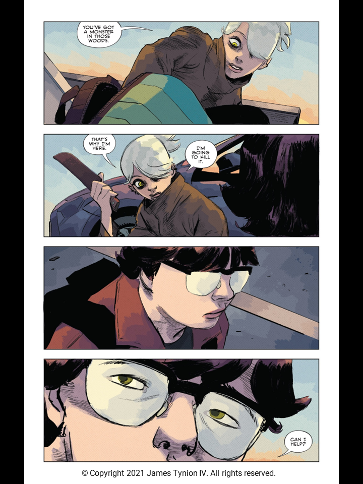
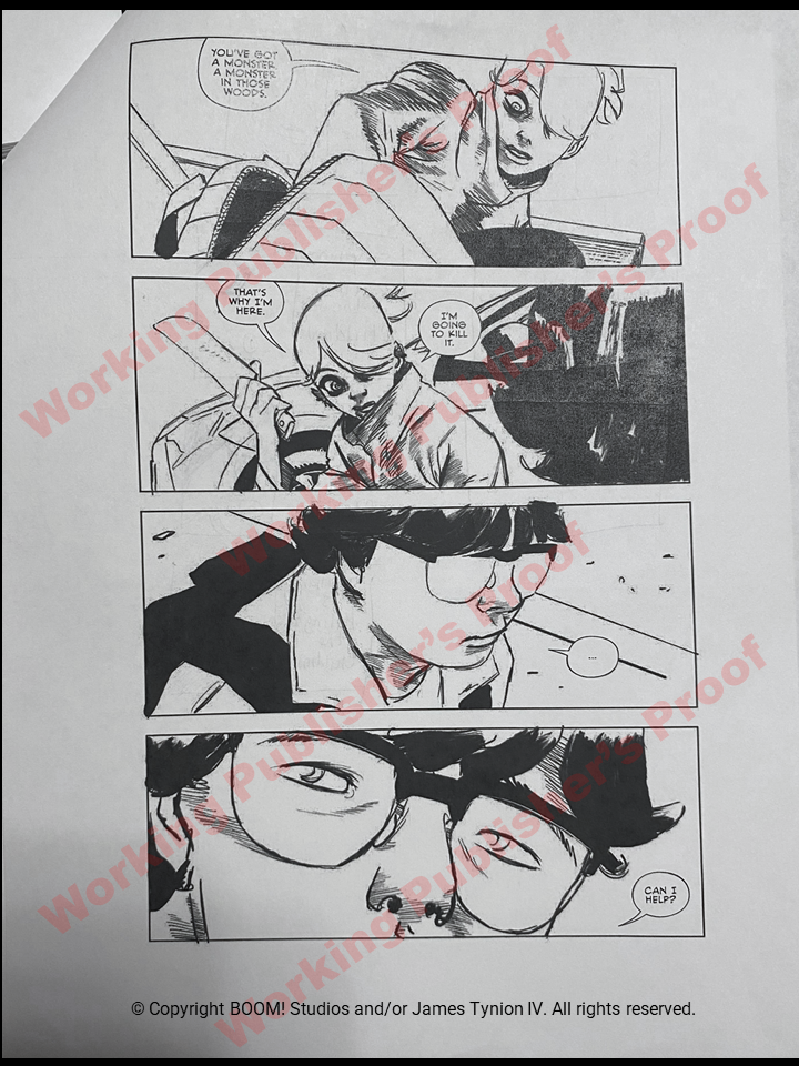
And here we have the interior pages comparing Published to the Working Publisher's Proof. Take your time with these as there are numerous differences in lettering, language and even some changes in creative treatment. Some of my favorites:
- Movement of "So you killed them, right?" from Page 13 to last panel of Page 12 as a lead-in
- Page 14's use of "@#$%" instead of "Fuck". All of the curse words throughout the issue are changed to characters. I wonder if James and Boom were debating going for a cleaner version of the book?
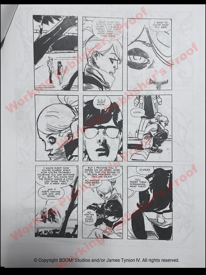
- On Page 21, lower left panel. In the WPP, Erica says "I know right now you're scared. Right now you are probably doubting you saw anything at all. But you know that the world makes a little less sense than it did a week ago." Then in the next bubble "And it keeps making less and less sense." In the published version, James changes the dialog to "I know right now you're scared. Right now you are probably doubting you saw anything at all. But you know that the world makes a lot less sense than it used to." Then in the next bubble "And every day that feeling gets a little worse." Much better, IMO!
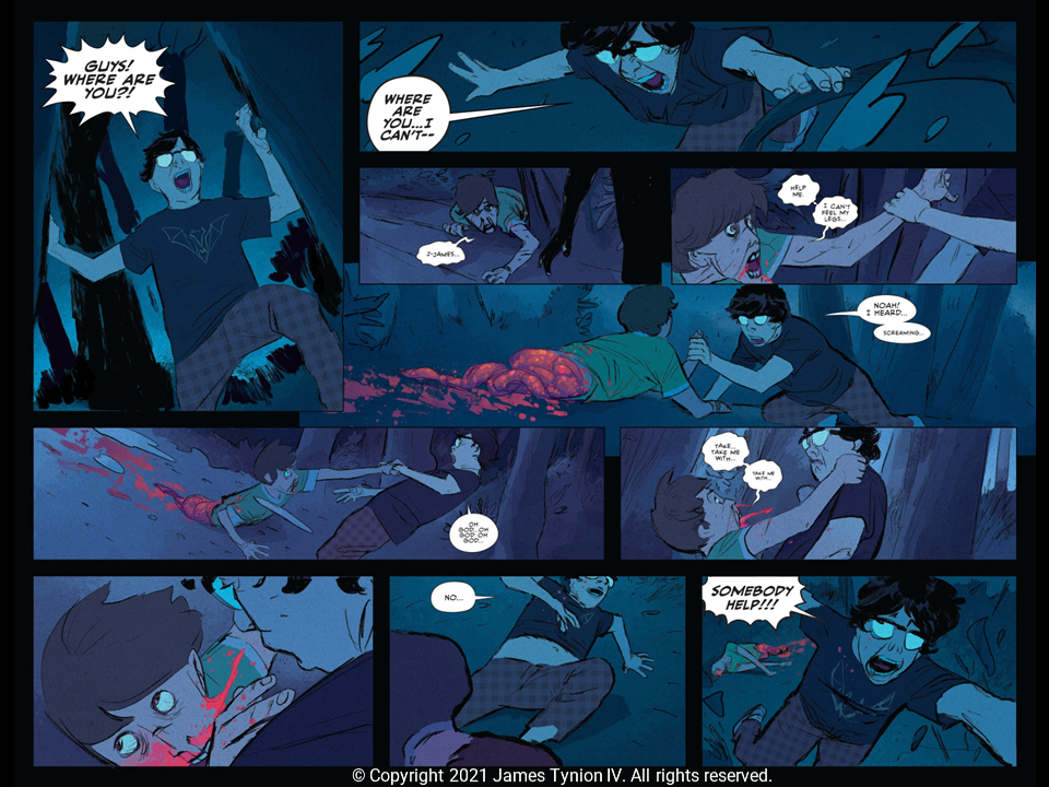
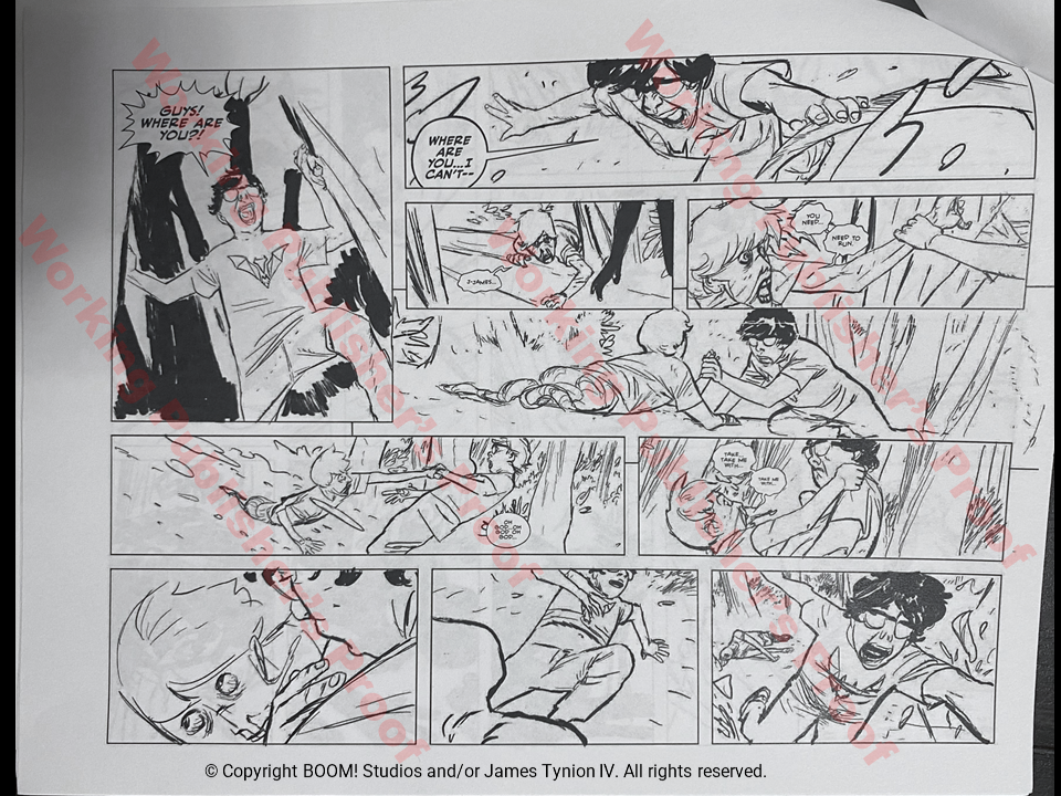
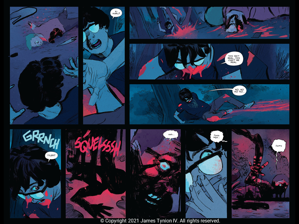
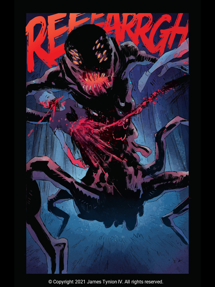
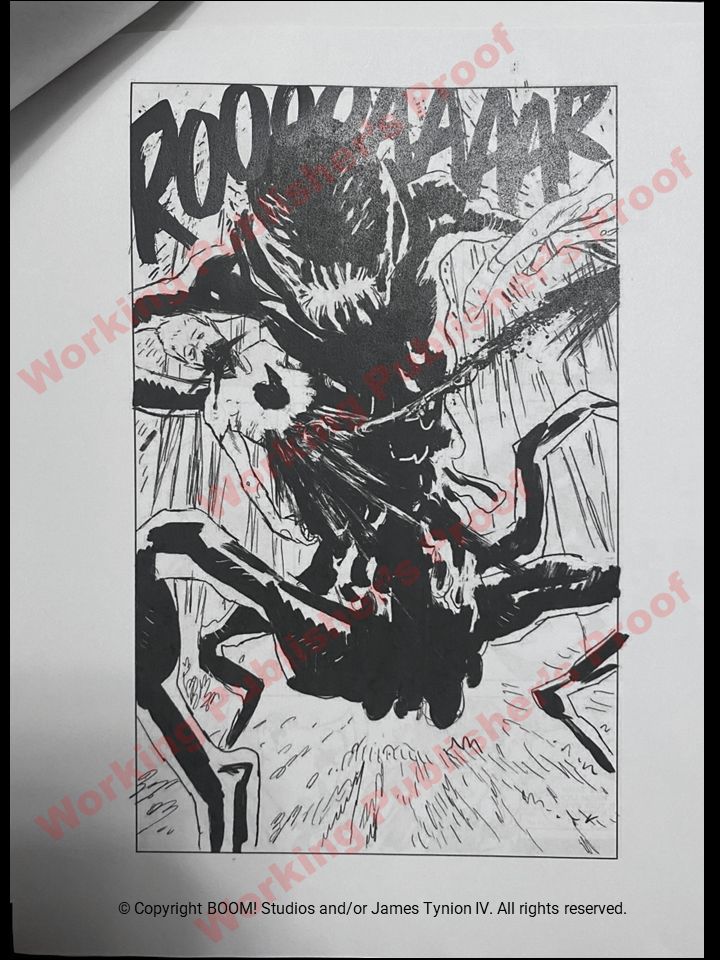
- On Page 26, the monster's sound is changed from "ROOOOAAAAR" to "REEEARRGH". This reminds me when Boom editors changed the sound to the monster Chris Shehan created in House of Slaughter Issue 1. For that one, they went from "SKRRREEEEEEE" to "REEEAARRRGGHHHH" which confuses me because it is a completely different monster. I do agree changing from ROAR for the oscuratype in Issue 1 was a good move.
Page 1
Page 2
Page 3
Page 4
Page 5
Pages 6-7
Page 8
Page 9
Pages 10-11
Page 12
Page 13
Page 14
Page 15
Page 16
Page 17
Page 18
Page 19
Page 20
Page 21
Pages 22-23
Pages 24-25
Page 26
Page 27
Page 28

