I am privileged to present the original art of Chris Shehan, cover & interior artist for BOOM! Studios' House of Slaughter Issues 1 to 5. I want to thank Kirby's Comic Art for their ongoing partnership in sharing so much incredible artwork. Chris' style is the perfect complement to Werther Dell'Edera's bold and emotionally charged work and it's clear why he was picked to bring Aaron and Jace's love story to life. I hope you enjoy this tour of House of Slaughter, including some surprises that didn't make it past the BOOM! review process. I also had the opportunity to ask Chris some questions about his House of Slaughter journey and art - enjoy!
TM: How did you find out you got the House of Slaughter gig?
CS: The editor reached out to me as I was finishing The Autumnal. They told me exactly what it was and where they wanted to go with it and as a SIKTC fan, I had to say yes.
CS: The editor reached out to me as I was finishing The Autumnal. They told me exactly what it was and where they wanted to go with it and as a SIKTC fan, I had to say yes.
House of Slaughter Covers
TM: Let's discuss the covers. Can you share your inspiration that drove the creative?
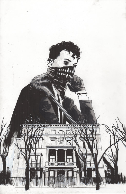
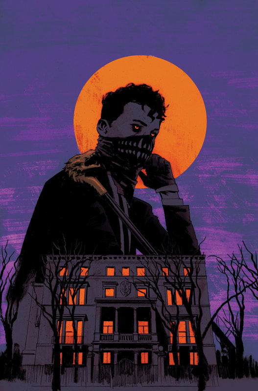
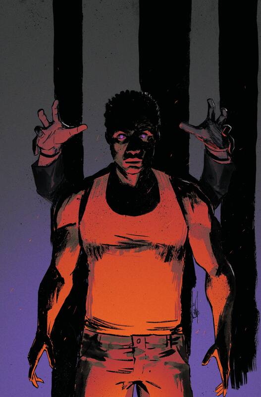
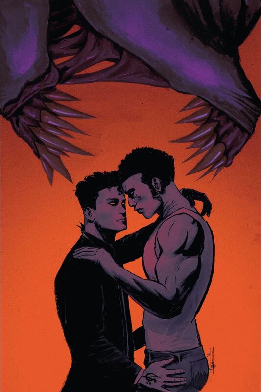
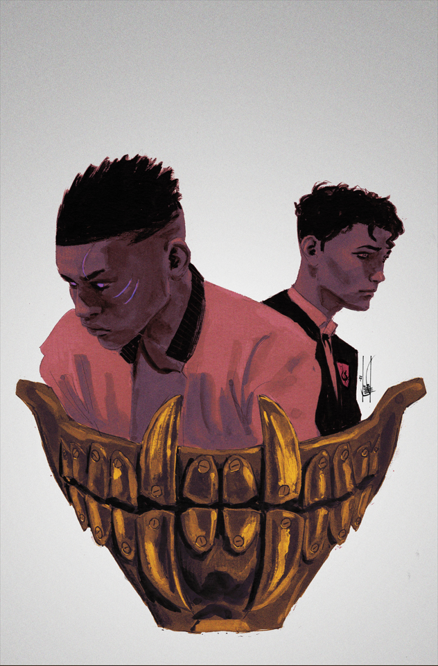
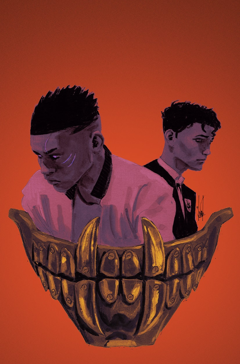
CS: The first cover felt the most mine compositionally. We were starting from scratch and I obviously had to include the House and our known character Aaron. I wanted something that represented Aaron and Jace so their eye colors are the cover colors (which I carried over through all 5 covers). With covers I always prefer strong shapes and simple color palettes over details and realistic color. Because it’s easier to remember and easier to spot across a comic shop. It always stands out on the shelf. It’s another thing I carried over into each cover, though I felt covers 2-5 were more inspired by ideas from editorial. I do love them all, but I would have done them a little differently looking back. The variant covers were also a huge inspiration for me, this series had so many variants by my favorite artists that it’s hard to not be inspired by that!
CS: The first cover felt the most mine compositionally. We were starting from scratch and I obviously had to include the House and our known character Aaron. I wanted something that represented Aaron and Jace so their eye colors are the cover colors (which I carried over through all 5 covers). With covers I always prefer strong shapes and simple color palettes over details and realistic color. Because it’s easier to remember and easier to spot across a comic shop. It always stands out on the shelf. It’s another thing I carried over into each cover, though I felt covers 2-5 were more inspired by ideas from editorial. I do love them all, but I would have done them a little differently looking back. The variant covers were also a huge inspiration for me, this series had so many variants by my favorite artists that it’s hard to not be inspired by that!
Issue 1
Issue 2
Issue 3
Issue 4
Issue 5
Major Moments in the House of Slaughter
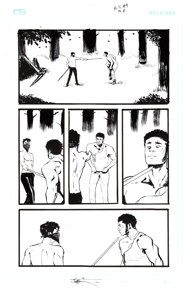
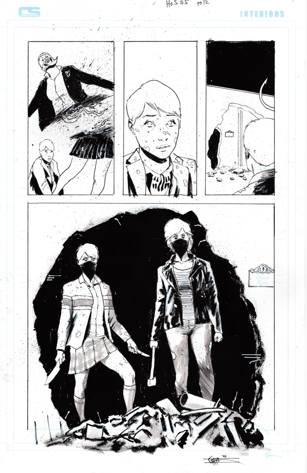
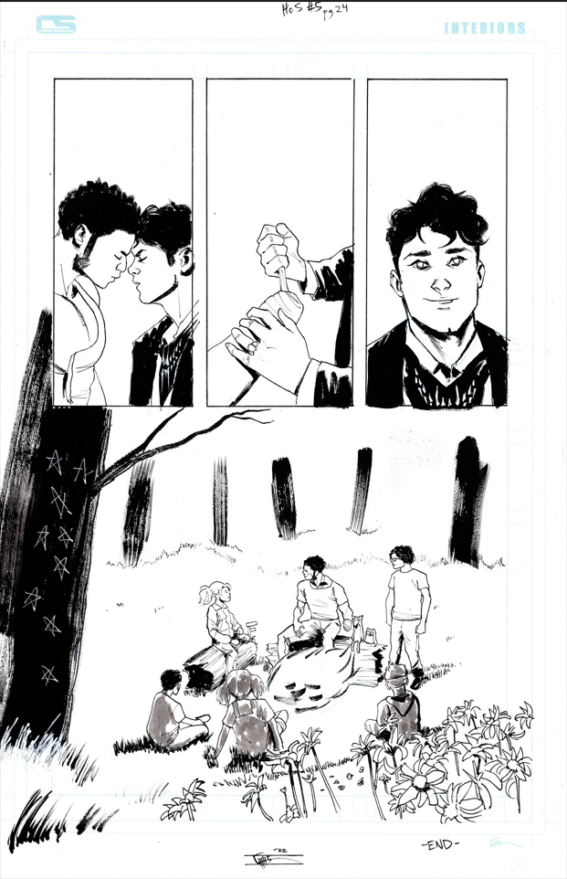
TM: I have a selection of interior pages here. What were your favorite moments in the series to draw?
CS: Anytime I got to draw the exterior of the house, I took my time, because I really loved drawing the house.
CS: Anytime I got to draw the exterior of the house, I took my time, because I really loved drawing the house.
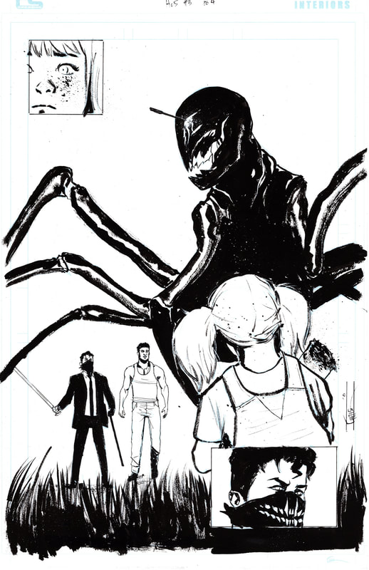
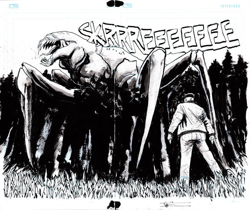
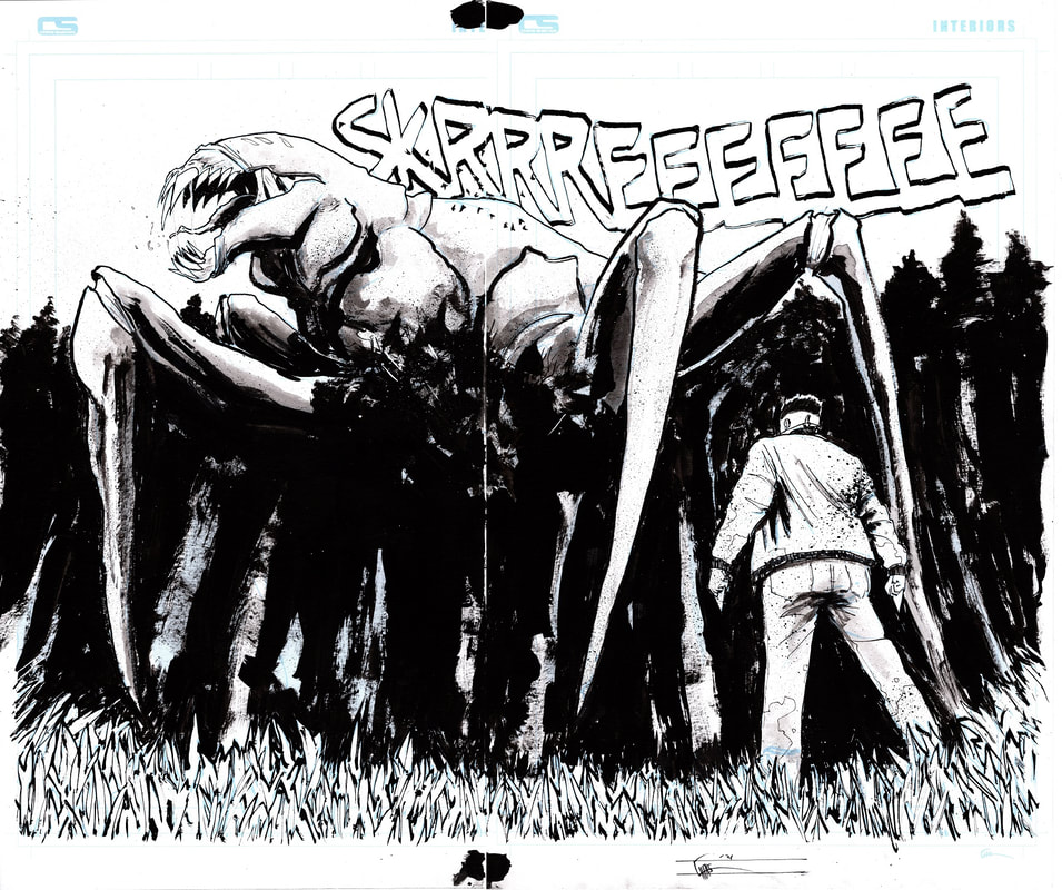
CS: I also loved any chance I got to draw monsters, but my favorites were monsters I could design myself. The double page spread with the monster towering over the trees has to be one of my favorites because I got to design what, at the time, was the biggest monster we’ve seen in the series.
CS: There’s also a great scene at the end where we get to see a bunch of interesting monsters and I had fun designing those.
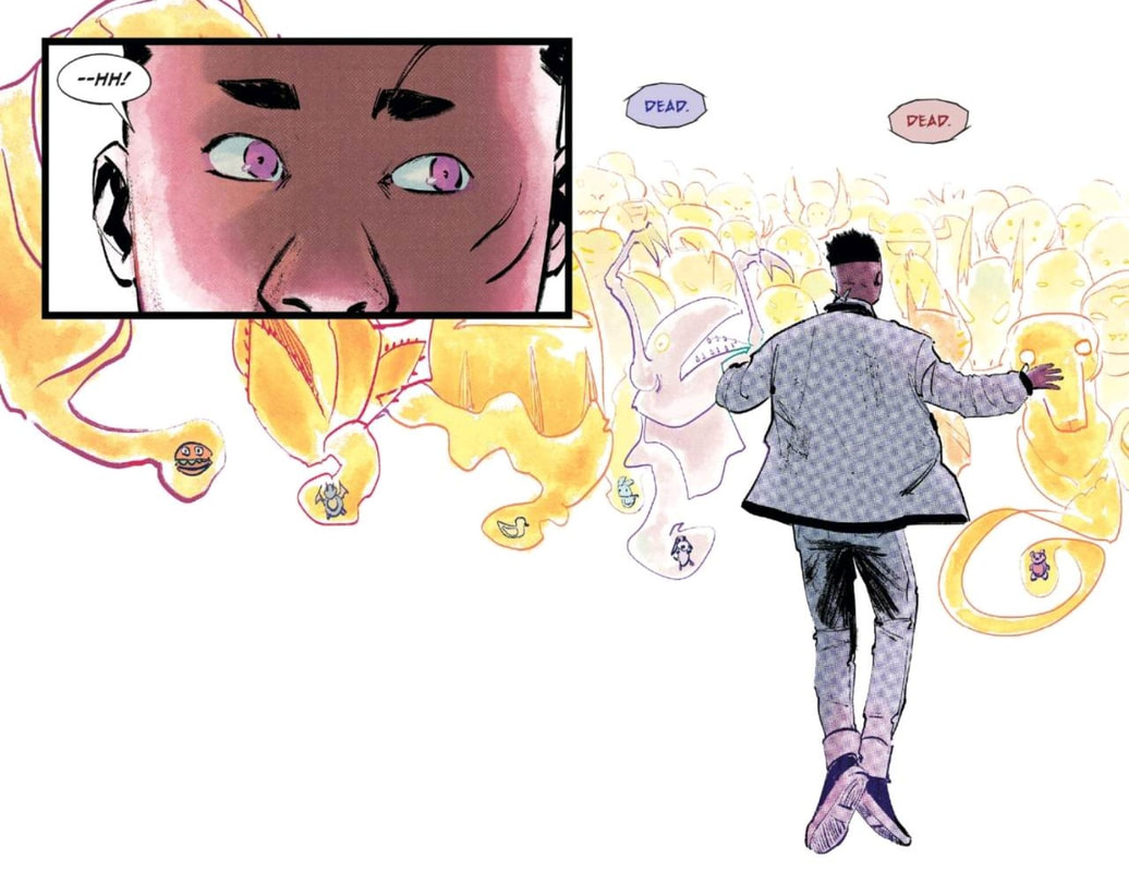
CS: My third favorite thing to draw (which may also count as monsters) was the limbo sequence where Jace sees the ghost of everyone’s totem. They were supposed to look non-threatening in that state so I went full Dr Seuss with goofy nonsense designs. Tate Brombal, the writer, private messaged me “pretend you’re designing Pokémon” so I went with that. They’re silly and I love them. If you look close, there’s some fun totems too, like a little cheeseburger totem.
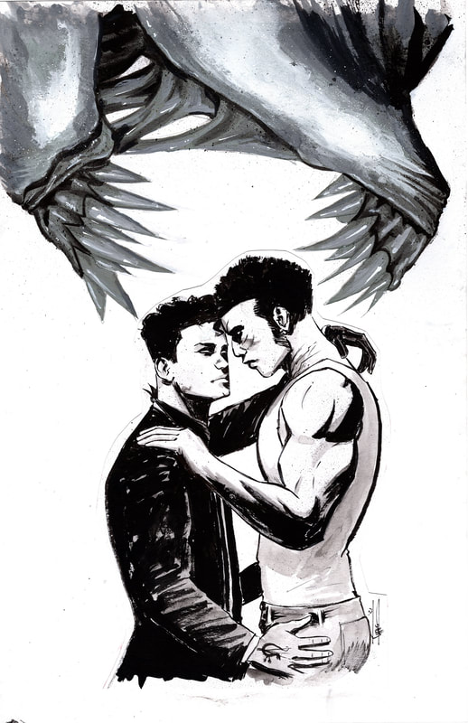
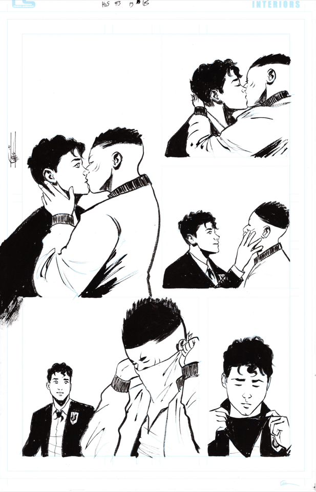
CS: Honorable mention were all of the intimate moments between Aaron and Jace. Being able to illustrate blatant queerness in a very popular comic meant a lot to me.
Select Interior Pages - Original Art Gallery
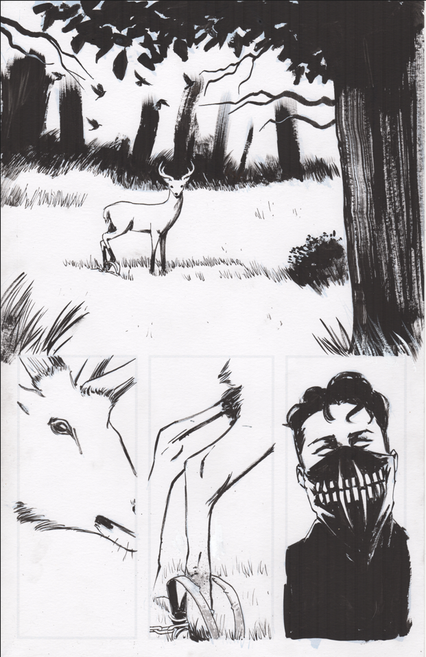
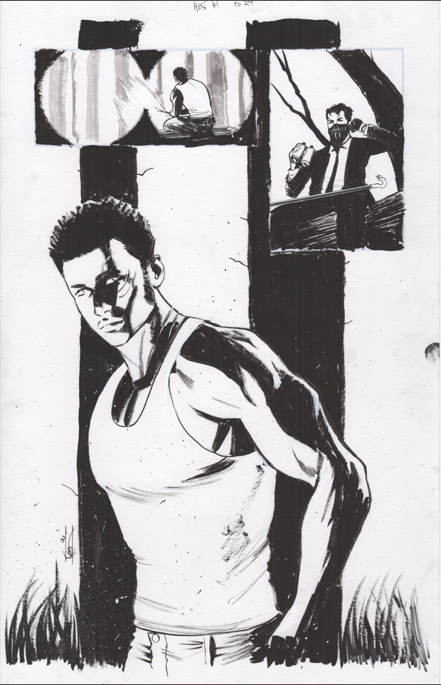
Click the images to see the full page
Click the images to see the full page
BOOM! Rejected Art
Not everything makes it past the editor's cutting room floor
TM: Let's discuss the rejected art
CS: Most of my layouts and pages were approved, with minor changes at most. And the changes were all positive and improved the art. Where I was rejected most was on cover concepts and even had to redo an entire cover (issue 3) and half of a cover (issue 4). I was trying to fit in to the SIKTC universe and they wanted me to stand out a little more and be a little more “me”. I still am figuring out what my style is so I didn’t quite know what that meant, but I did my best. A lot of cover layouts were rejected too, but that’s just part of the process. Turn in 3-4 ideas and they gotta pick one. All in all, their editorial is world class and anything rejected was rightfully so. Though personally, I feel I shine most on covers when I can do my thing and do whatever I’m feeling and I love when projects trust me a little more on the cover. As I get better, I’ll be able to do more of that in the future.
CS: Most of my layouts and pages were approved, with minor changes at most. And the changes were all positive and improved the art. Where I was rejected most was on cover concepts and even had to redo an entire cover (issue 3) and half of a cover (issue 4). I was trying to fit in to the SIKTC universe and they wanted me to stand out a little more and be a little more “me”. I still am figuring out what my style is so I didn’t quite know what that meant, but I did my best. A lot of cover layouts were rejected too, but that’s just part of the process. Turn in 3-4 ideas and they gotta pick one. All in all, their editorial is world class and anything rejected was rightfully so. Though personally, I feel I shine most on covers when I can do my thing and do whatever I’m feeling and I love when projects trust me a little more on the cover. As I get better, I’ll be able to do more of that in the future.
I must admit, I don't understand what happened here. The submitted #5 cover has the same purple and orange background color scheme as Issues 1 to 4 previously approved and published.
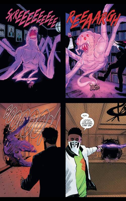
HoS 4, Page 12-13 Spread
Original Art submitted with lettering "SKRRREEEEEEE"
Published Pages with lettering revised to "REEEAARRRGGHHHH"
I much prefer Chris's original monster sound to the one published. It's a new monster, or some ginormous oscuratype variant. Who knows what sound it's going to make? And I much more readily can see this nightmare going "skree" rather than "reagh". So I'm puzzled on this one.
The Making of an epic Erica Slaughter piece
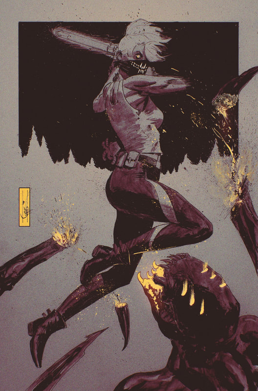
TM: I absolutely love this Erica Slaughter piece, let's talk about that
CS: I wanted to celebrate the SIKTC Eisner as both a fan and as someone who is part of the SIKTC family. I wanted to do something for me, and something that would let me play around with ink the way I love to for fun. I also am trying to subtly convince Boom to let me do a SIKTC cover, something I’ve not done yet. Lol
CS: I wanted to celebrate the SIKTC Eisner as both a fan and as someone who is part of the SIKTC family. I wanted to do something for me, and something that would let me play around with ink the way I love to for fun. I also am trying to subtly convince Boom to let me do a SIKTC cover, something I’ve not done yet. Lol
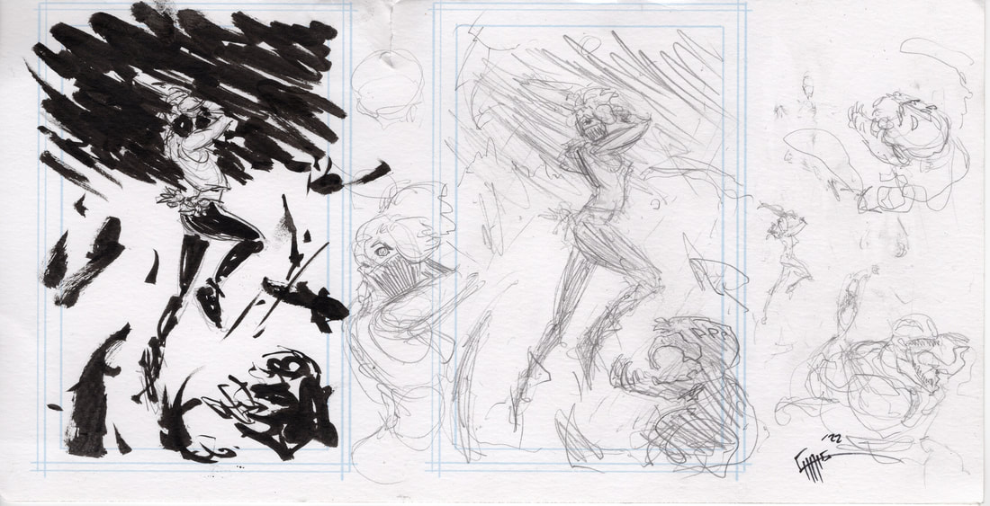
Concept
TM: Is there anything else about this series you want to share with your fans?
CS: I loved working on it and I’d love to do more, if the creators and the fans will have me. I also love the House of Slaughter work that has come after me, both the second arc and everything I’ve seen from the third arc so far (Jace is back!!). I also have some fun ideas for if I do come back. And some wishes (what I’d give to draw a silver mask or emerald mask story). It’s a great series and I’m very grateful to have been part of its launch. If I can draw more monsters, more lore and mythology, and everything I didn’t get the chance to do on my first run, I’d love it! And if you’re checking out this new Book of Slaughter, keep a look out because I may be involved in a very small way. :)
CS: I loved working on it and I’d love to do more, if the creators and the fans will have me. I also love the House of Slaughter work that has come after me, both the second arc and everything I’ve seen from the third arc so far (Jace is back!!). I also have some fun ideas for if I do come back. And some wishes (what I’d give to draw a silver mask or emerald mask story). It’s a great series and I’m very grateful to have been part of its launch. If I can draw more monsters, more lore and mythology, and everything I didn’t get the chance to do on my first run, I’d love it! And if you’re checking out this new Book of Slaughter, keep a look out because I may be involved in a very small way. :)
And on a personal note...
|
I had the pleasure of meeting Chris in Austin, TX at Bat City Comic Professionals (now located in Bradenton, FL) in late Oct, 2021 just after House of Slaughter debuted. Truth be told I had read Something is Killing the Children TPB #1 but my collecting interests were elsewhere and I hadn't caught the bug for the series just yet. My buddy Brian Lassiter invited me and I figured, what the heck, I've never had an artist do a remark in person so that sounded cool. I asked for a "monster" on the cover, not really sure what they were called and Chris appreciated the break from the non-stop Aaron sketches he had been doing. But Brian and LCS buddy Matt Live had a surprise for me. While I was gone, Chris did a second remark of Erica on my book. I absolutely love it, and it's got a permanent home in my personal collection.
|


